Zach Chan approached me in late 2018 to create a website and brand identity for his growing physiotherapy business.
He wanted a website that was easily found through search and a place that he could direct new patients to. Additionally, he wanted an elevated logo/brand that he could use across his accounts, business cards, and documents.
The live website can be viewed here.
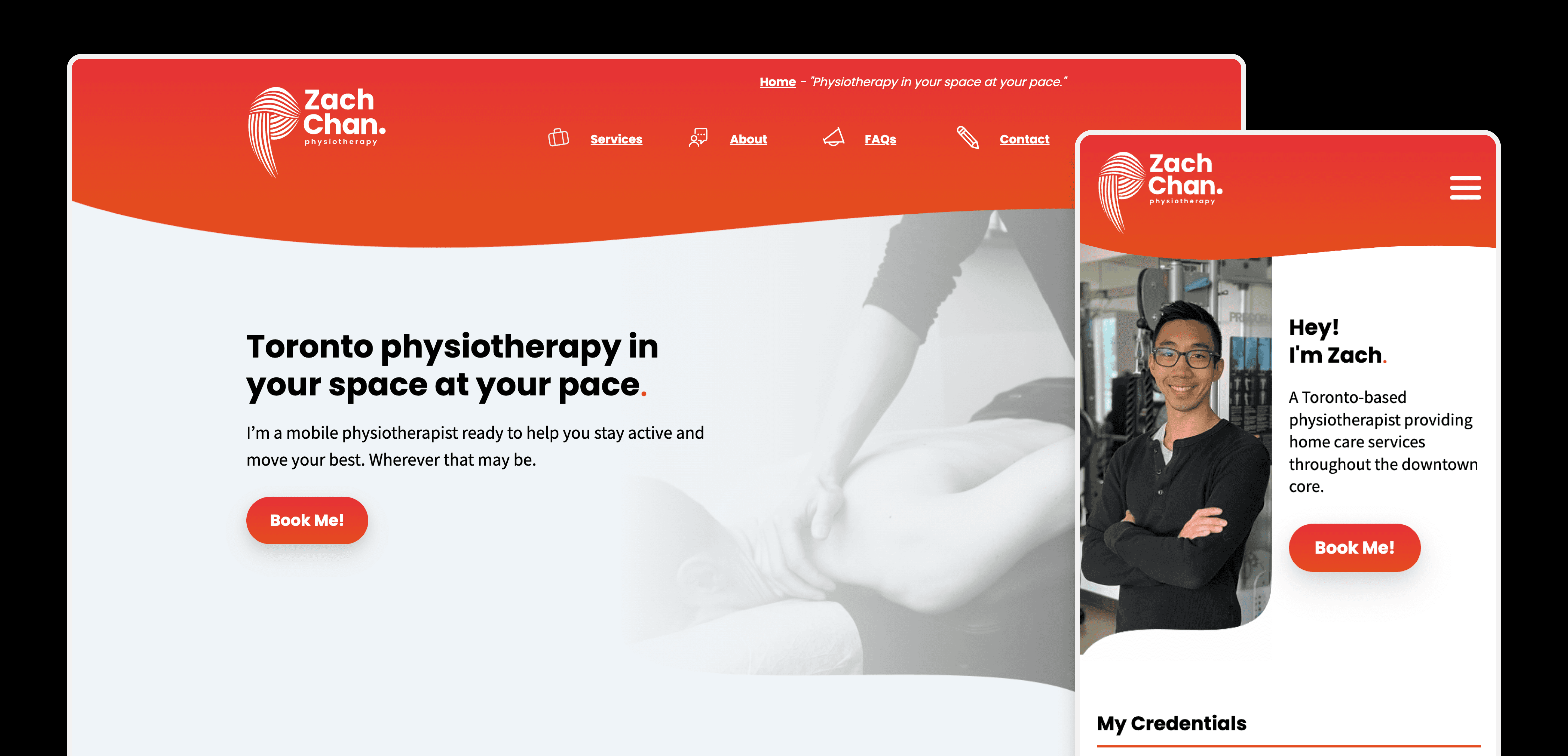
Physiotherapy websites can often be quite staid/clinical: cool blues/greens and a more conservative presentation. We wanted to build something that stood out from those. The bright orange gradients and the use of a bold font (Circular) helped achieve this across the site.
Brand Look & Feel
The logo went through a number of iterations. Physiotherapy is a physical job involving a full understanding of the body's muscles & joints and I wanted to bring those ideas into the treatment.
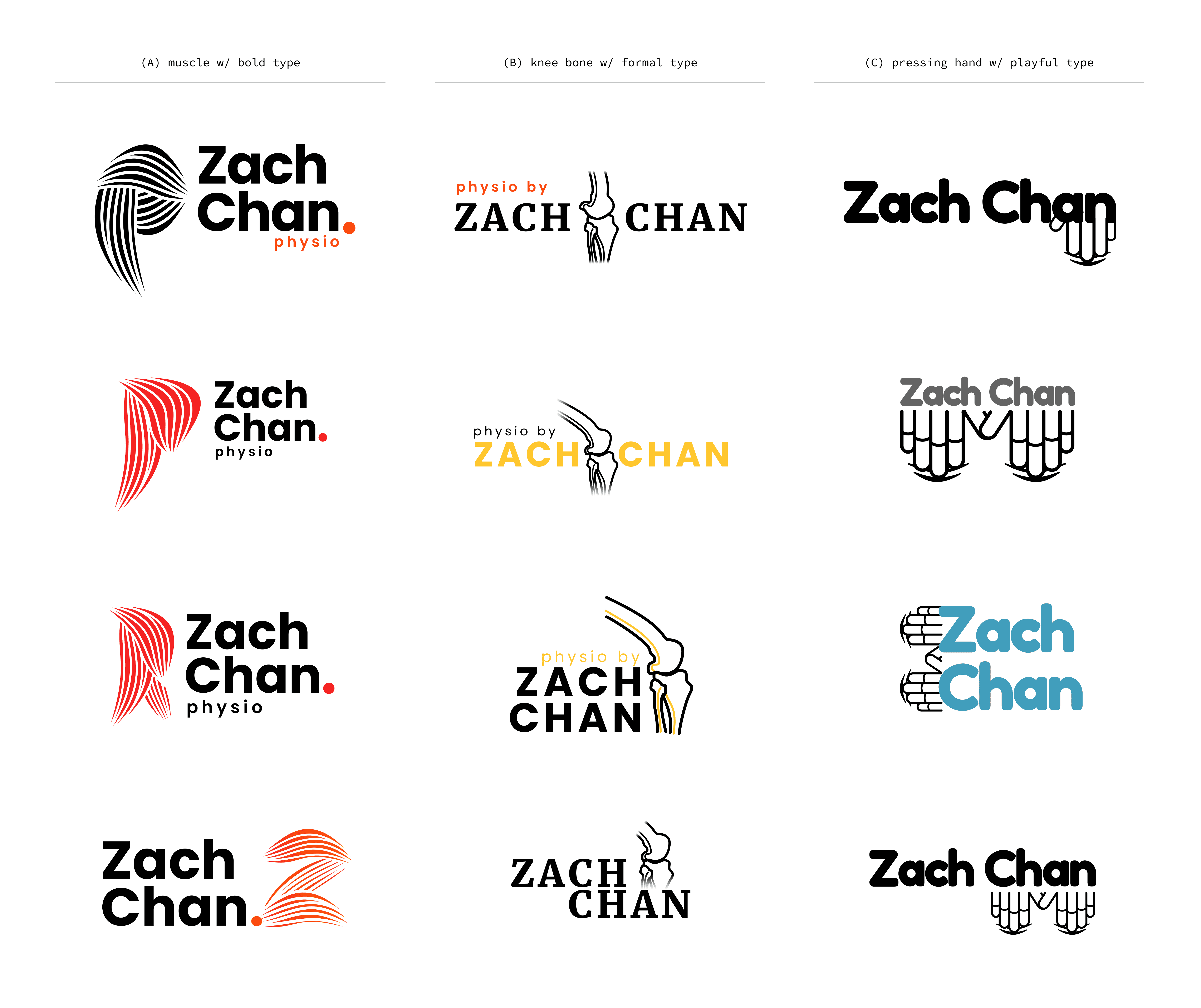
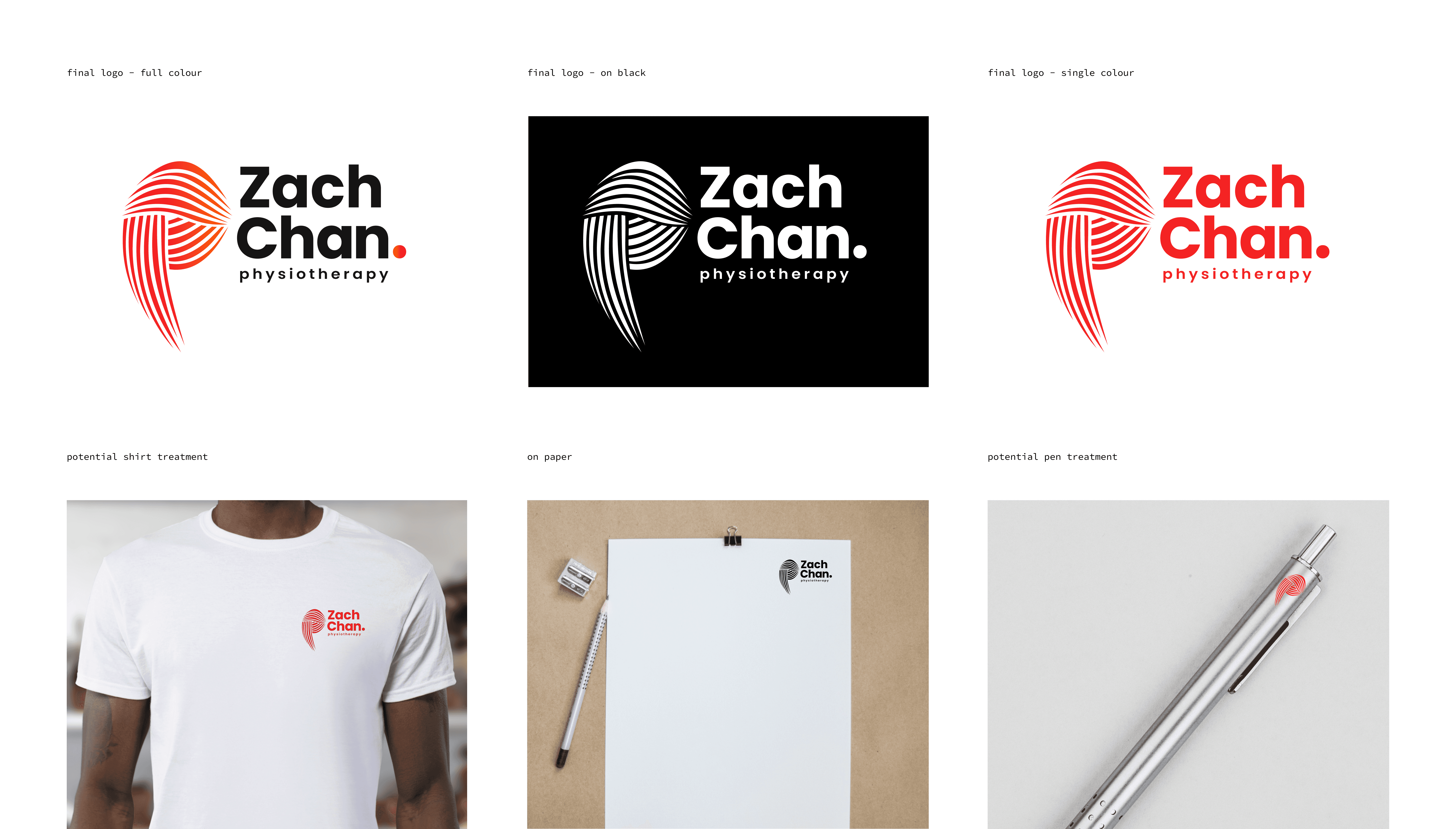
The treatments creating letterforms out of muscle-like shapes resonated with both of us. That became the final direction. I refined this treatment to be something Zach could use across a number of formats: both digital & physical.
Thanks to Zach Chan for engaging with me on this project and giving me permission to share this work in my portfolio.