Assessment questions are a foundation of Top Hat's product and feature in many places across the platform. I led a major overhaul of how questions were authored and rendered.
The result was a new foundation that was both easier to use and more scalable.
A broken experience
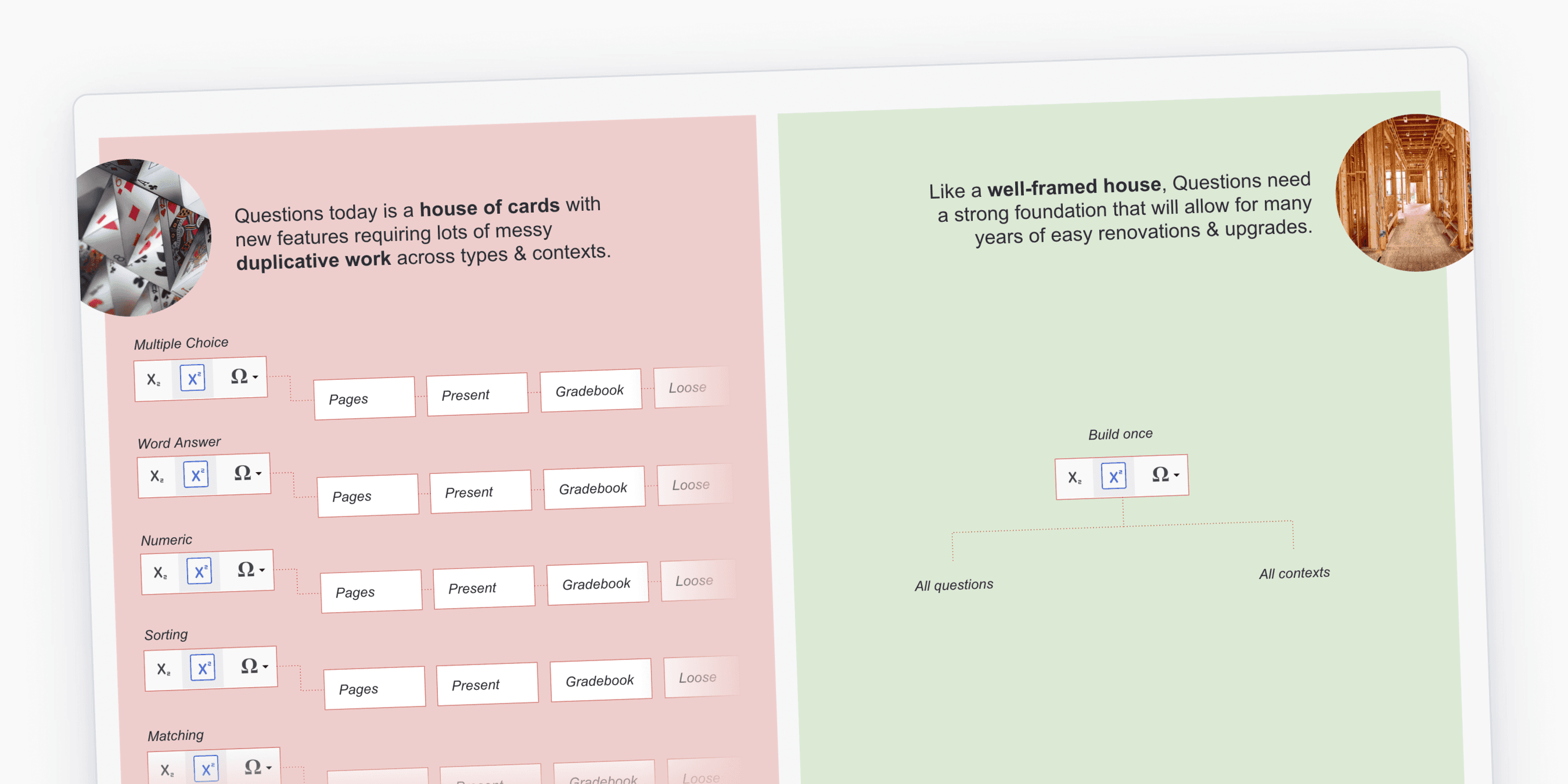
Top Hat's original approach to questions had evolved with the platform as more types and features were added.
Along the way, the approach to authoring and rendering these questions started to break down with inconsistencies in what features existed on each type and a visually busy authoring experience.
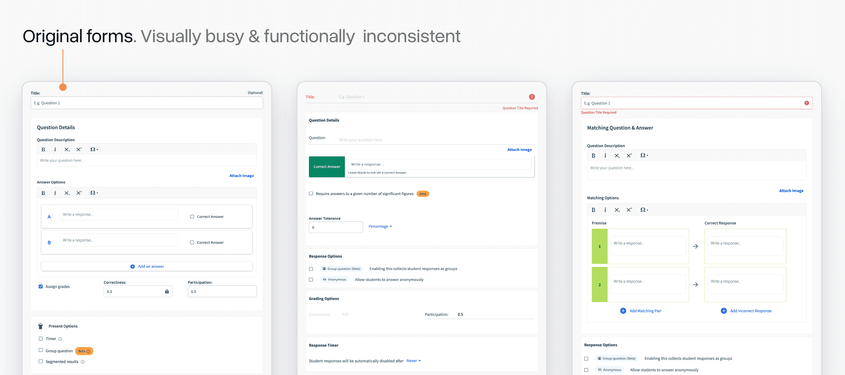
Something we'd talk about a lot at the start of this project was the "iceberg" nature of our questions system. On the surface, it just seems like a handful of forms/cards, but underneath laid an immensely complex system with many surfaces and states to consider.
I made a slide that illustrated this when pitching this project to Product leadership:
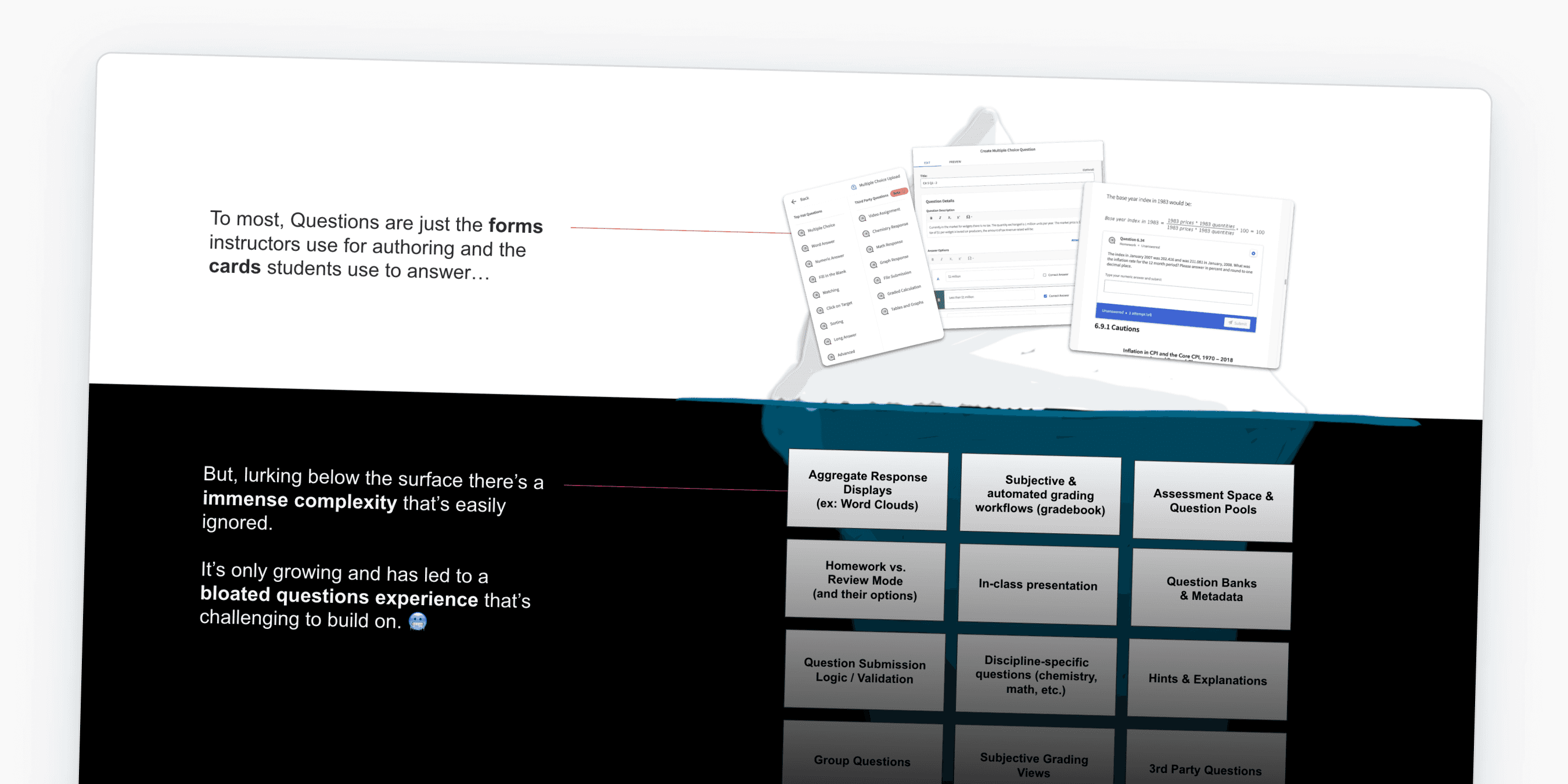
Because we had never built a proper foundation for questions, there was a lot of duplicative work happening. Even adding simple features like support for superscript and subscript could take many months of effort.
I often used the analogy that this was a "house of cards" rather than a "well-framed house":
Exploring options
I went through a lot of iterations of how we might build a more stable system. My initial theory was a "block-based" approach that work similarly to Google Forms.
You'd have blocks for different types of responses, rich-text, images, etc.
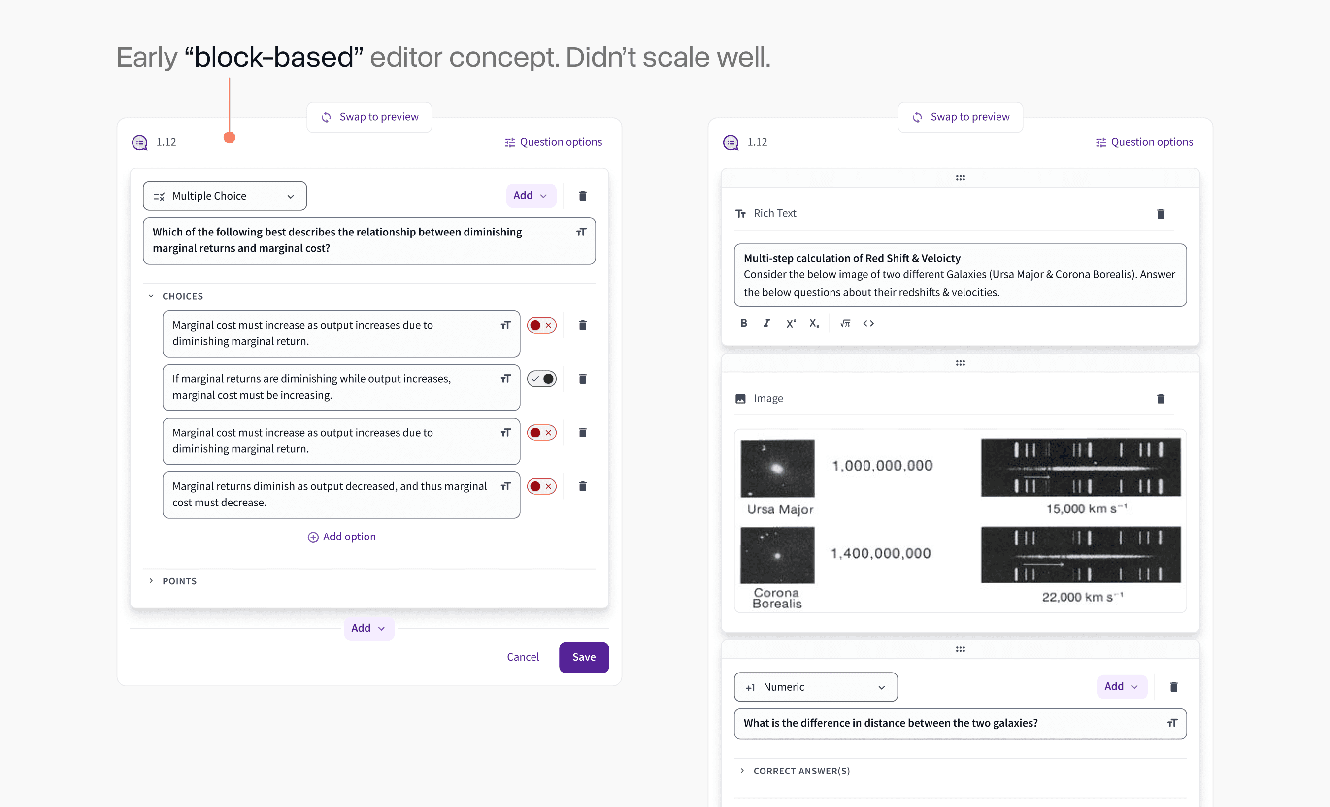
While this would be a much simpler evolution of what we already had, it became clear quickly that it didn't scale well to more complex question types.
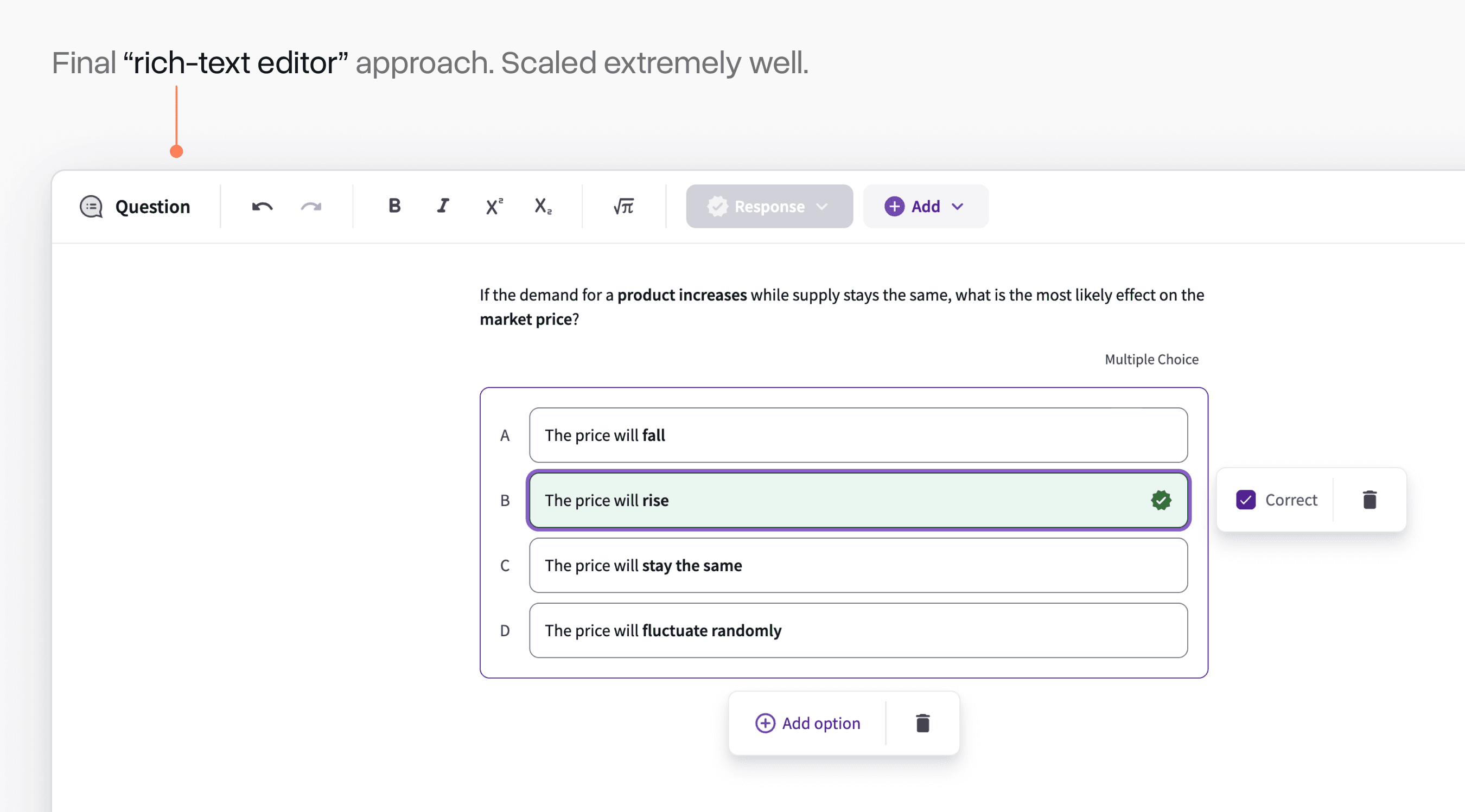
I eventually settled on pursuing a rich-text editor system that worked similarly to Notion. Although it was a more complex up-front build, the open-ended nature of an editor like this unlocked a lot of possibilities for how we could scale up questions over time.
Solving early usability challenges
As we built out this editor experience and tested it with early users, we encountered countless usability challenges.
An early one was how we managed toggling correctness on the option for a question. I had come up with an iOS-style toggle, but many early users complained that it was unclear how it worked.
After many iterations, we settled on a simple checkbox. Sometimes the most obvious interface is the best one!
Another interesting challenge was deleting things. This was a new experience for many professors and it was not always clear what they were deleting when they clicked the trash-can icon.
We added a "projection" treatment that showed up when you hovered over a delete action that would make it clear what this triggered. Complaints about misclicks on this dropped precipitously after we shipped this simple change.
Initially, we didn't support customizing the title of each question. This quickly became a common complaint.
When we went and watched usage recordings of the editor, we noticed a lot of users assumed clicking on the word "question" would do this, so we anchored on that existing behaviour for this new feature.
Complex interactions
As we added different block types, we encountered lots of challenges with how to progressively disclose features effectively.
Our numeric response type was a great example of this. The initial menu would re-position based on where the input was placed and could be expanded to access more complex properties.
A similarly challenging one was the addition of LaTeX expressions for math and chemistry. Myself and Senior Product Designer, Miao Yu, worked hard to ensure professors saw the rendering of these expressions update in real-time.
We prioritized efficiency and flow in every part of the interface. Even small options like setting points and adding timers had highly dynamic interfaces that disclosed more options as you engaged with them.
WYSIWYG
The classic "what you see is what get" concept was a major design principle from very early on in the project.
It was extremely important that there was not a major visual gap between the question editing experience and the rendering of questions in product surfaces. This had been a major limitation of the previous approach.
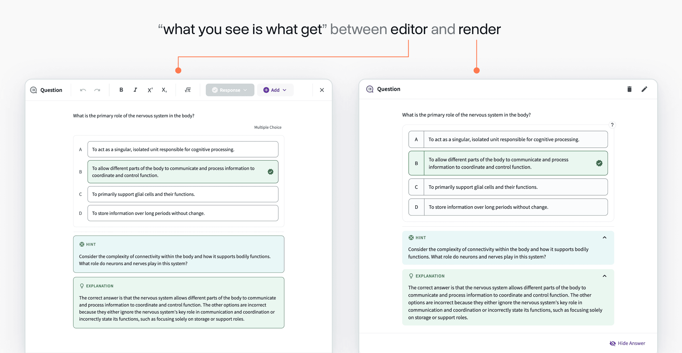
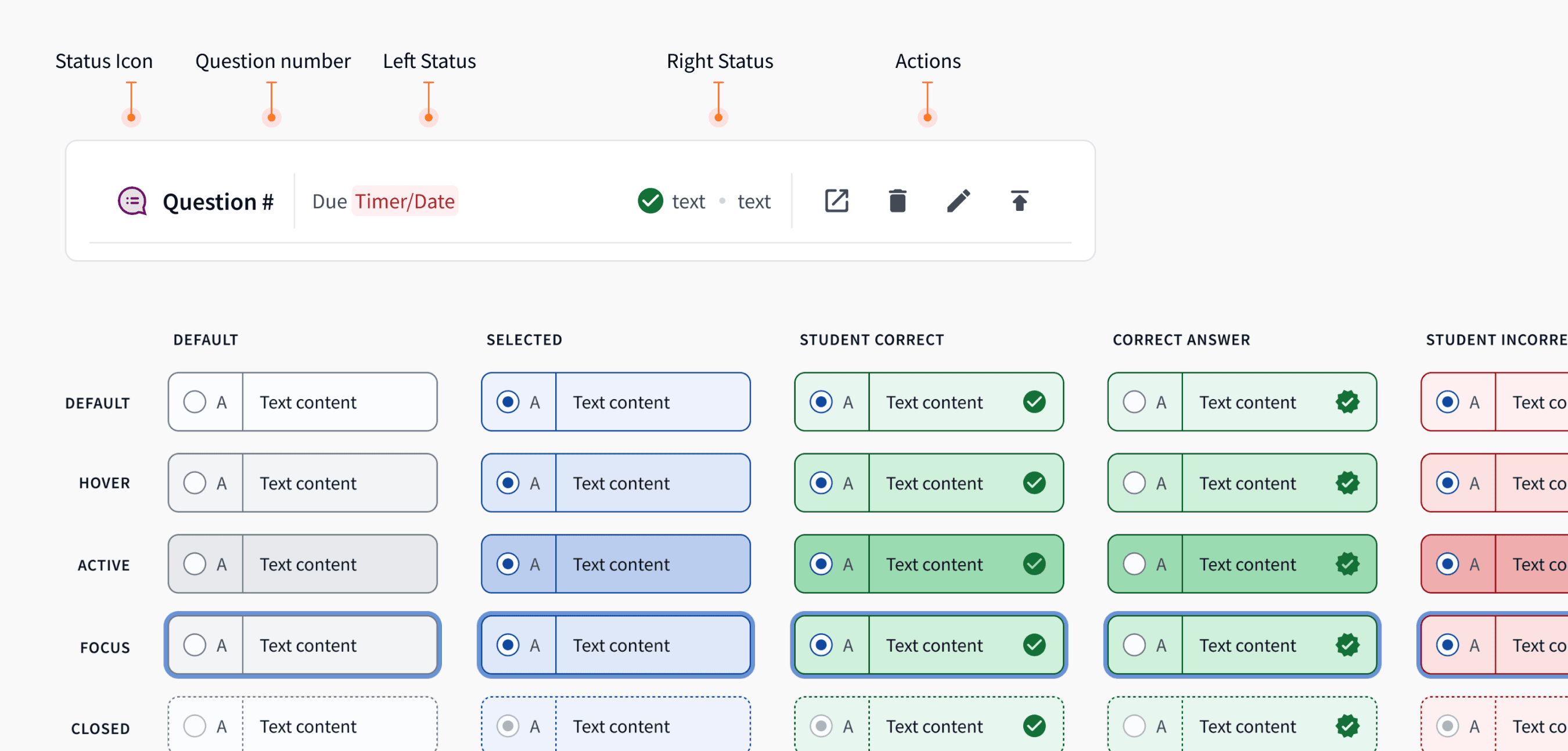
The rendering side of questions could be an entire case study in itself with many surfaces and states to consider. I worked with Product Designer, Alex Cooksey to define these. Below is just a tiny snippet of the large spec we had to build and refine for these details.
Onboarding
Millions of questions are authored on Top Hat's platform each year, so it was important that we eased our users into the experience.
The modal where you select which type of question you want to use was overhauled to be more visually appealing and provided an opt-in (and eventually opt-out) toggle that allowed professors to try the new experience on their own time.
Responding to the ChatGPT moment
In the middle of this project, the advent of LLMs changed how questions would be authored forever and we had to quickly pivot in response.
We built a question generation feature that enabled instructors to highlight any text on their page and automatically make an editable question out of it.
Being able to produce a new feature like this at a high velocity would have never been possible if we had not built this new foundation in the year previous.
Acknowledgements
Top Hat's new question foundation was the product of our entire team's efforts. Thank you to Top Hat Designers Kevin Lee, Ilene Shioguchi, Alex Cooksey, and Miao Yu who all made major contributions. On PM, thank you to Adrian Gazzoli, Ana Lobo, and Elia Rechtman. Finally thank you to engineering leaders Rahul Bhatt, Andrew McGowan, and Sean Fahey.