Top Hat is used by millions of students to access engaging course content both inside and outside of class.
The surface area of Top Hat's platform has grown immensely in recent years, but the primary navigation for getting around was struggling to keep up.
I took stock of what needed to change and worked to ship a new implementation of the navigation. Along the way, I had to account for many potential states, our own user's "muscle memory", and building for future features.
The Existing Navigation
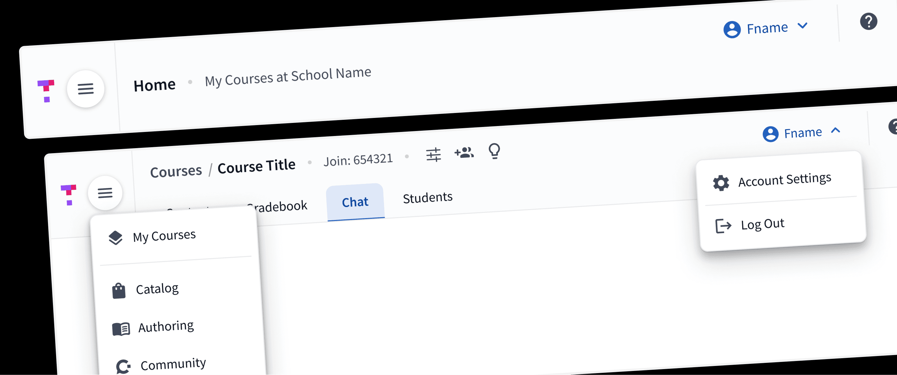
It's easiest to think of Top Hat's platform as having two "sides":
Instructor-side: where professor's organize their course content, assign it, and (later) grade student's work.
Student-side: where students can access their course materials and complete assignments both in and out of class.
The current navigation was effectively completely different for both of these areas, despite having a lot of common elements. This created a number of usability issues:
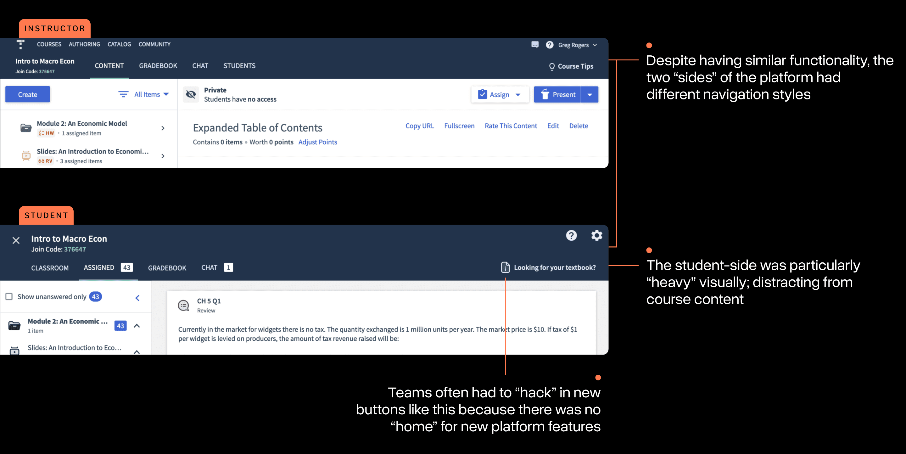
Additionally, many years of feature development had evolved the platform significantly. The navigation didn't always keep up with this, leading to a large volume of inconsistencies across views.
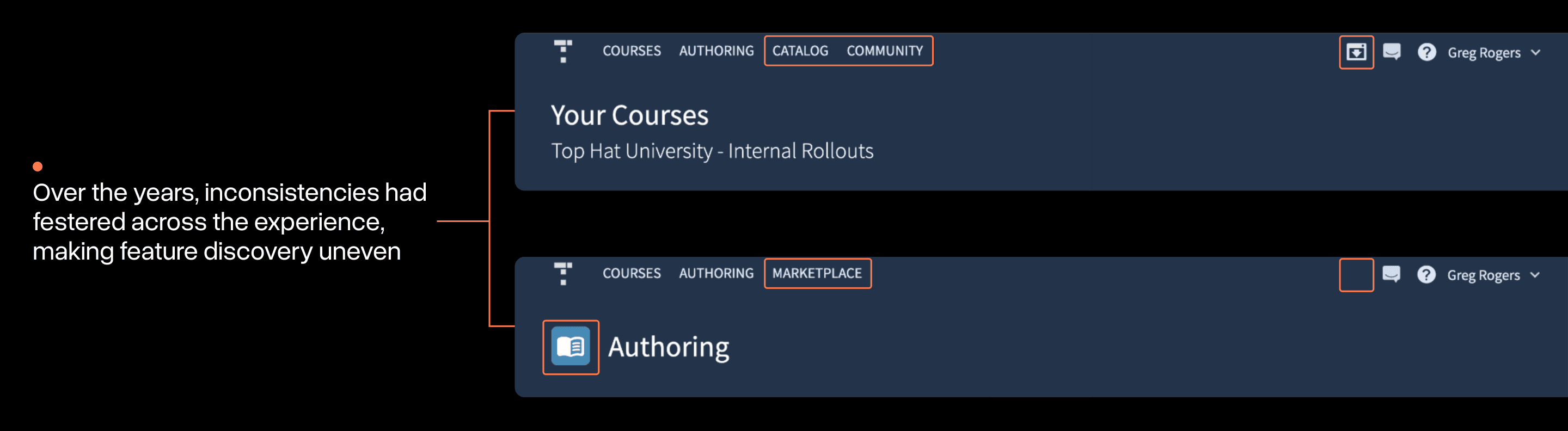
Beyond user experience, Top Hat as a business was also starting to feel strain from the navigation:
Expansion: finding places for new offerings that didn't quite fit the mold was difficult.
Technical: the implementation of the existing navigation code was expansive, brittle, and difficult to work with.
All of these issues motivated our team to re-think the navigation from scratch.
Mapping it Out
After spending some time gathering a deep understanding of the various states, exceptions, and edge cases the navigation can be in, I started my explorations with a site map.
In the early weeks of the project, I was really focused on seeking simplicity. I tried to radically reduce the number of items supported by the navigation.
An early attempt at a new site map. In retrospect, this one was naively simple. More complexities would emerge.
This became an essential document for discussing options with stakeholders and helped me gather more requirements.
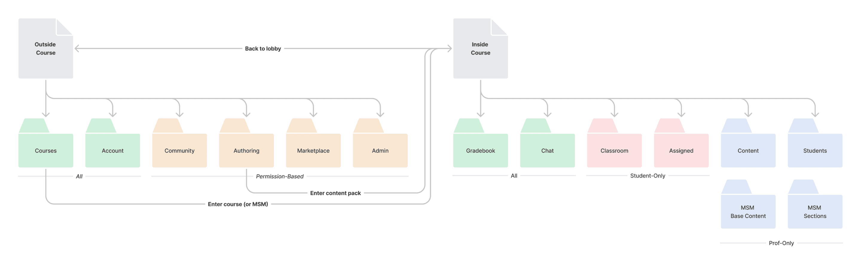
These resulted in a new information architecture for both sides of the platform that was clearer, but handled all the possible states that needed to be supported.
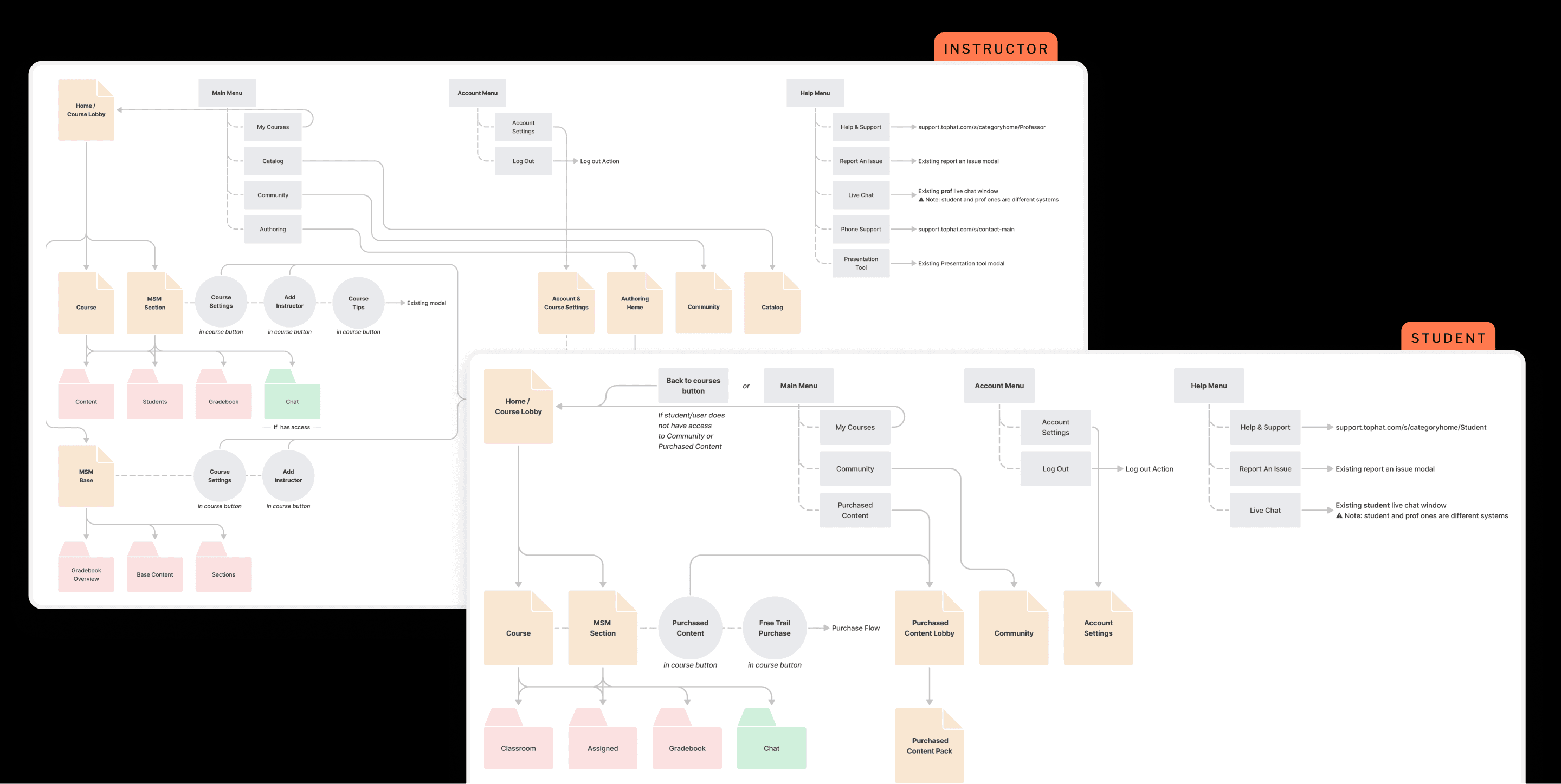
The completed sitemaps: less "simple" than I had idealized, but accounting for everything needed
There were a few big principles I wanted to make sure were built into the new system:
One navigation: regardless of what "side" of the platform you're on, the navigation should look and function the same.
Patterns for scale: ensuring the interface I constructed didn't make too many assumptions about the future of the platform. Future features I didn't know about yet should have a "place".
All of these ideas informed my final implementation.
Focusing on the system
My early design work focused on trying to build out a small system for the navigation that offered a lot of options for customization while still keeping a cohesive look and feel.
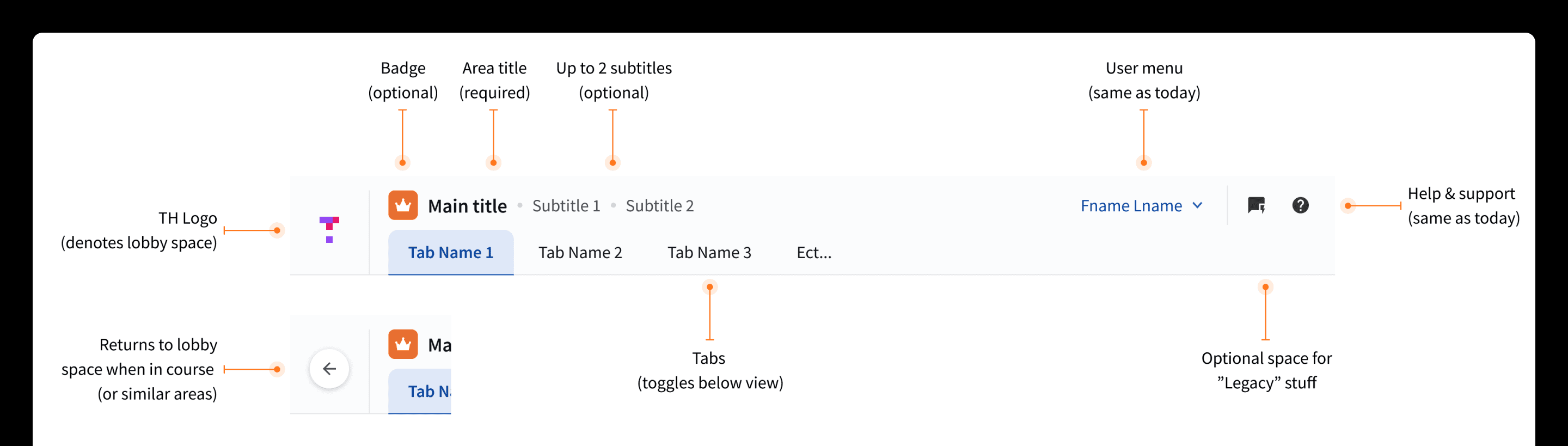
An early draft of a new Navigation System. This helped build consensus with teams (how their domain 'fit')
I decided early on that the design exercise here was more about evolution than revolution. With literally millions of potential users that would access it, I knew I had to be intentional about what would change.
Testing to Build Confidence
As aspects of the navigation system began to"lock-in", I started clarifying what parts had a lot of uncertainty around them.
I choose to run a small unmoderated usability study where I had 15 Top Hat power users complete some navigation tests to see if I was on the right track.
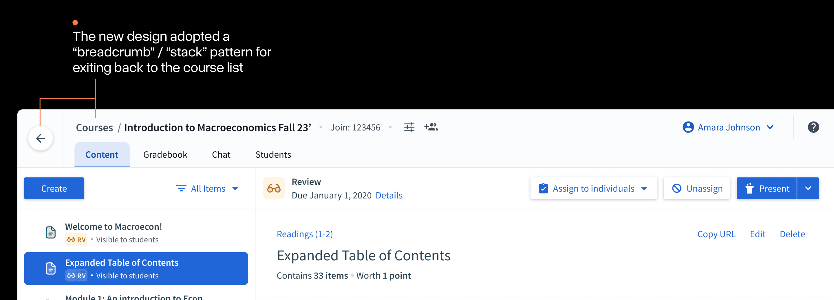
Test A: Getting between courses
Exiting and entering different courses is an essential user flow in Top Hat. Although the placement was roughly the same, the presentation, naming, and other details were quite different:
Heat maps from the study showed that the vast majority of users were able to navigate this change easily. Often doing it in mere seconds:
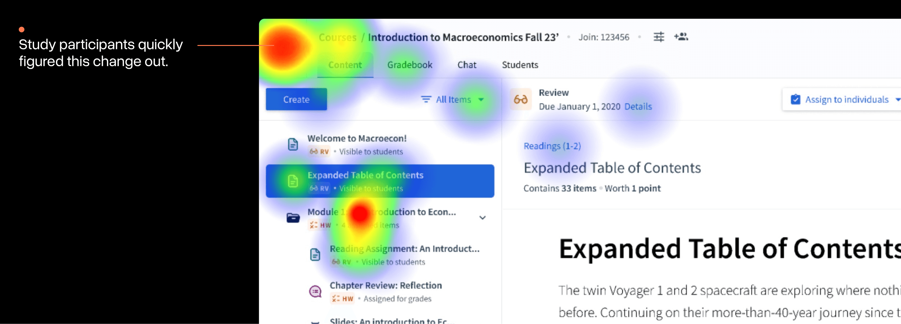
Quick note: the "heat" around the folder was attributable to a confusing word in the test instructions; not a usability issue.
Test B: Find adjacent functionality
I had made more dramatic changes to where users would find some of Top Hat's more "adjacent" pieces of functionality.
In the old navigation, how these features were accessed was varied. In the new design, these features had been folded under a single "user menu" in the top right:
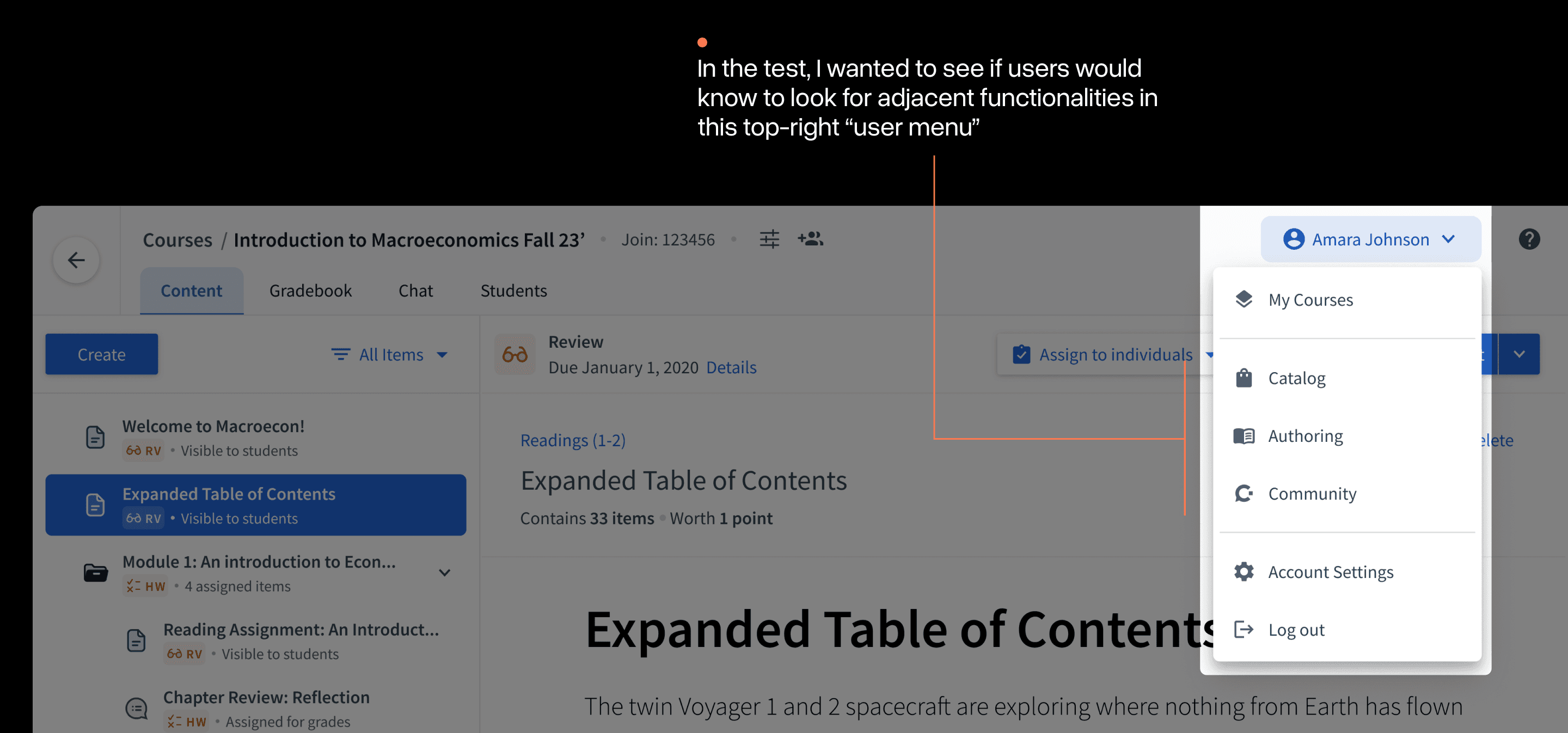
In testing, I asked users to navigate to a feature called "Catalog" that was now in this menu. As the heat maps show, nearly every user failed to figure this out.
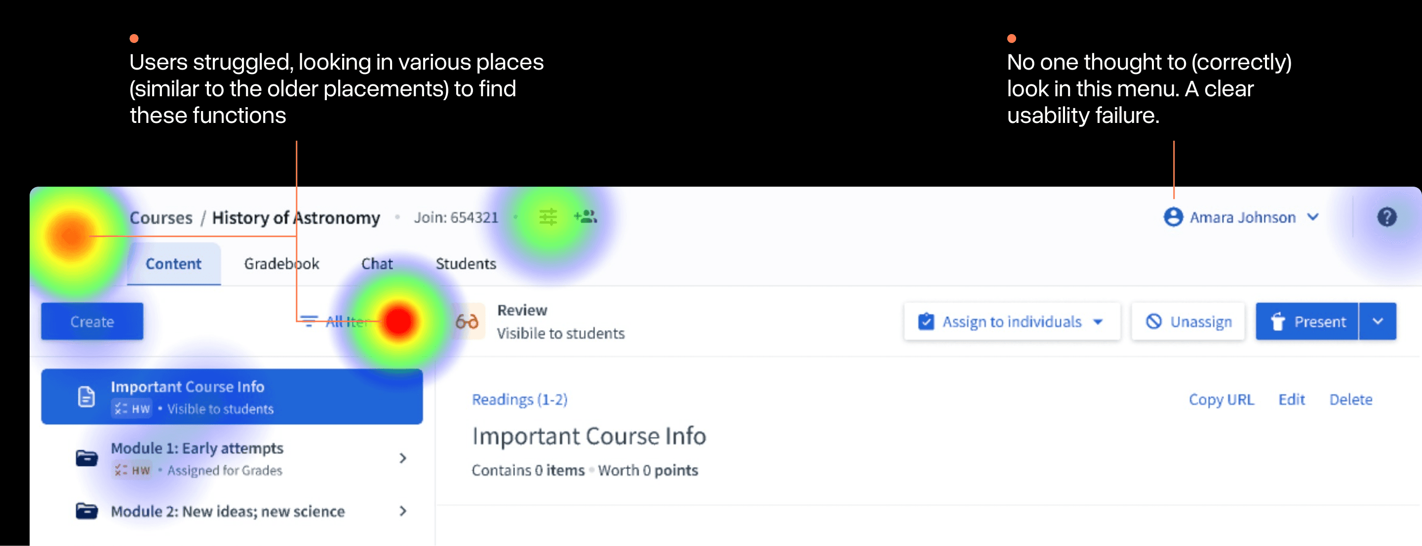
Optional comments on the test also brought this placement up as "confusing" and too far from the previous experience.
It was obvious this part of the experience needed more work.
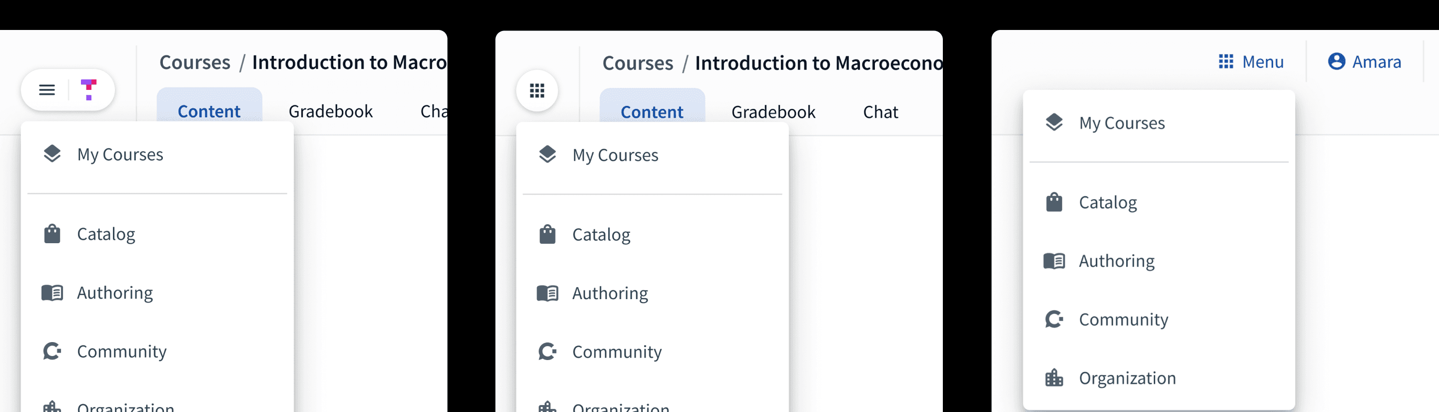
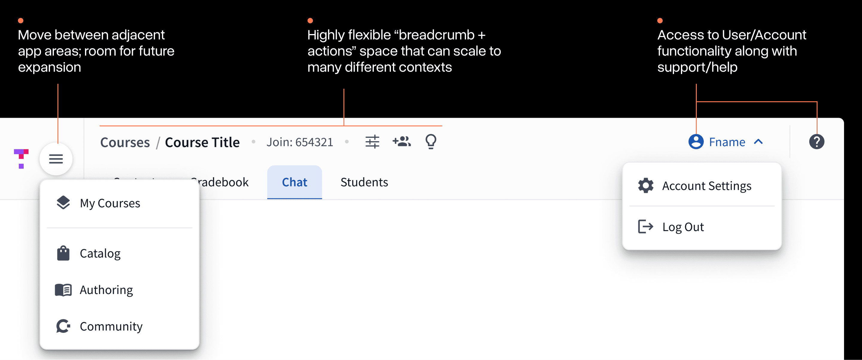
Evolving Menu Placement
I decided to split the "user menu" into two separate menus to create a more obvious distinction. The challenge was finding the right place to put it:
Assorted iterations in "main menu" placement within the new navigation system
After some experimentation, I settled on the two menus being on opposite sides similar to many other products. The new left-hand menu would house adjacent functionality and the right-hand"user menu" would focus only on account functionality.
The Final Approach
A number of refinements after testing led to the final approach that we chose to build:
The final implementation involved at-least 2 dozen distinct configurations of the navigation for different combinations of state, user type, and view.
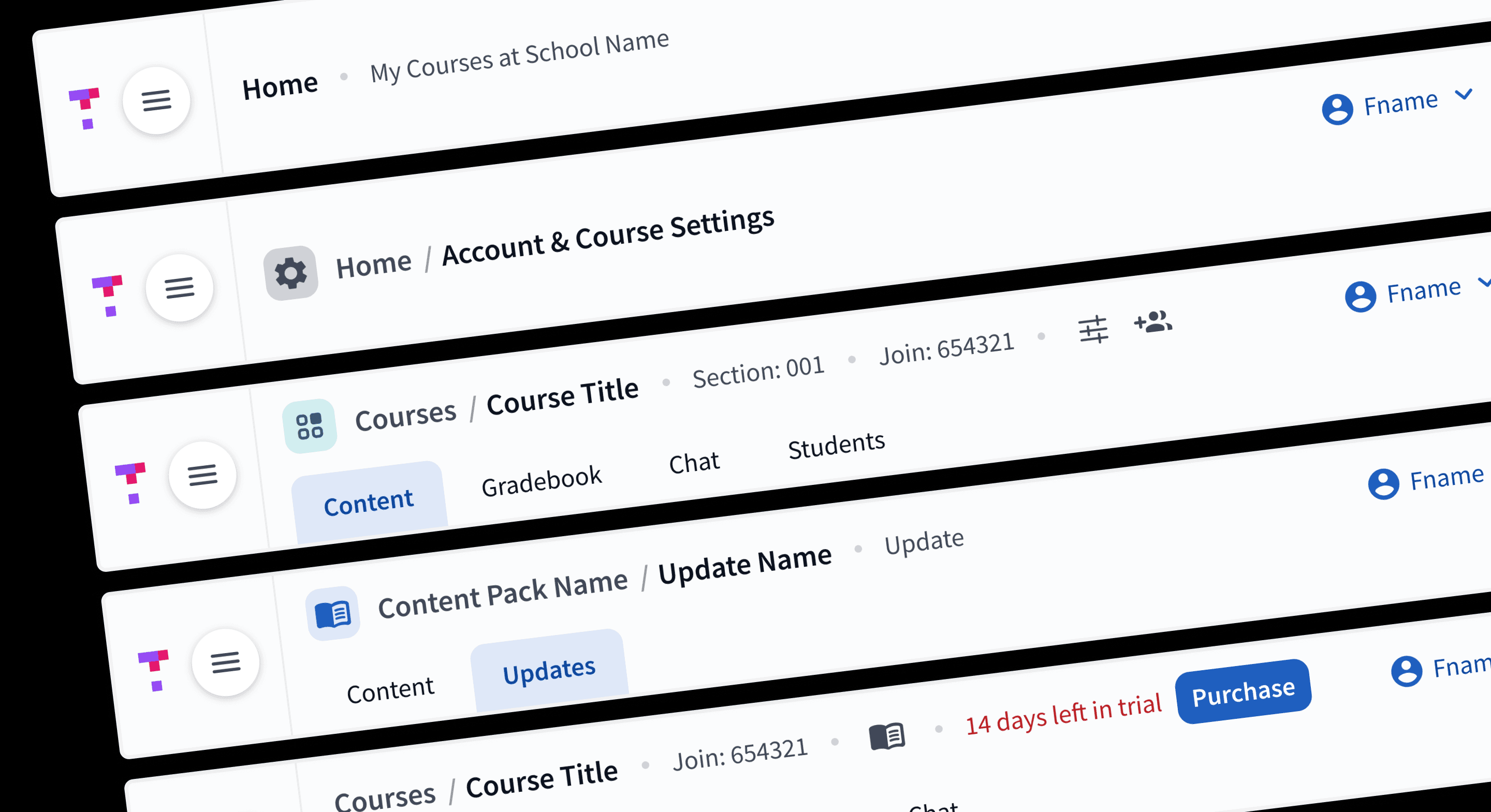
A small preview of the many final configurations of the navigation.
Designing the system to scale early-on really paid off during the implementation phase. As we inevitably discovered edge cases, we were able to use the various built-in options to quickly find a "home" for them.
Launching in Stages
Even when you're careful, launching a change to an interface literally everyone uses in your app can be scary. Change is hard.
As a team, we spent a lot of time thinking about this. Elements like in-app communication and good support documentation were critical to helping people bridge the gap between the new and old navigations ahead of Fall classes.
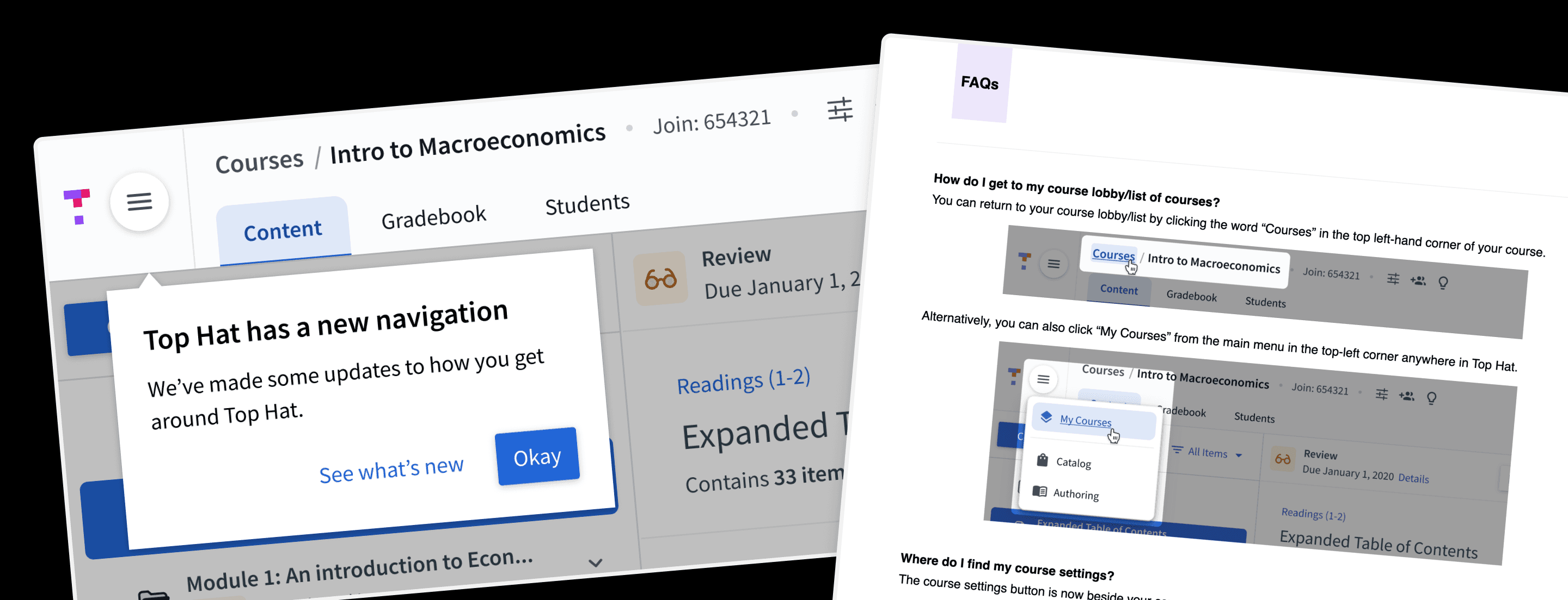
Collection of artifacts supporting the launch of this new navigation
Beyond these in-app elements, we also conducted a large staged-rolled out of the feature. Giving time between each to respond to any issues or feedback that emerged.
Thankfully, the final rollout went relatively smoothly with minimal issues or friction for most users.
Epilogue
Personally, this was an intimidating project. Navigation changes can often be some of the most divisive for users. This is compounded when potentially millions of users will experience the change all at once.
This project taught me to focus on taking actions that can reduce reduce your uncertainty for a given decision while avoiding analysis paralysis.
Since shipping, it's been interesting to watch our navigation continue to grow. The system has held up overtime with new use cases, but requires some vigilance to maintain the integrity of the overall patterns. A forever challenge with design systems.
Acknowledgments
This project wouldn't have been possible without the help of many people at Top Hat. Thank you in particular to my Engineering Manager, Shawn Drape (+ his team), for making the space to do it and being an amazing collaborator(s).