Artery is an arts and culture organization with a unique premise: giving people the tools to organize intimate cultural events in their home. Think folk music on someone's rooftop or a poetry slam in a living room.
Often, visitors sign-up for Artery when they are ready to go to their first event. The current flow for this needed to do a better job of guiding them through it for the first time.
Across three separate projects, I led design efforts to re-think Artery’s sign-up, purchase, and ticketing experiences. Each of these projects slowly elevated a common first experience for Artery visitors into something that was compelling, clear at each step, and highly usable.
Create a compelling sign-up and payment flow
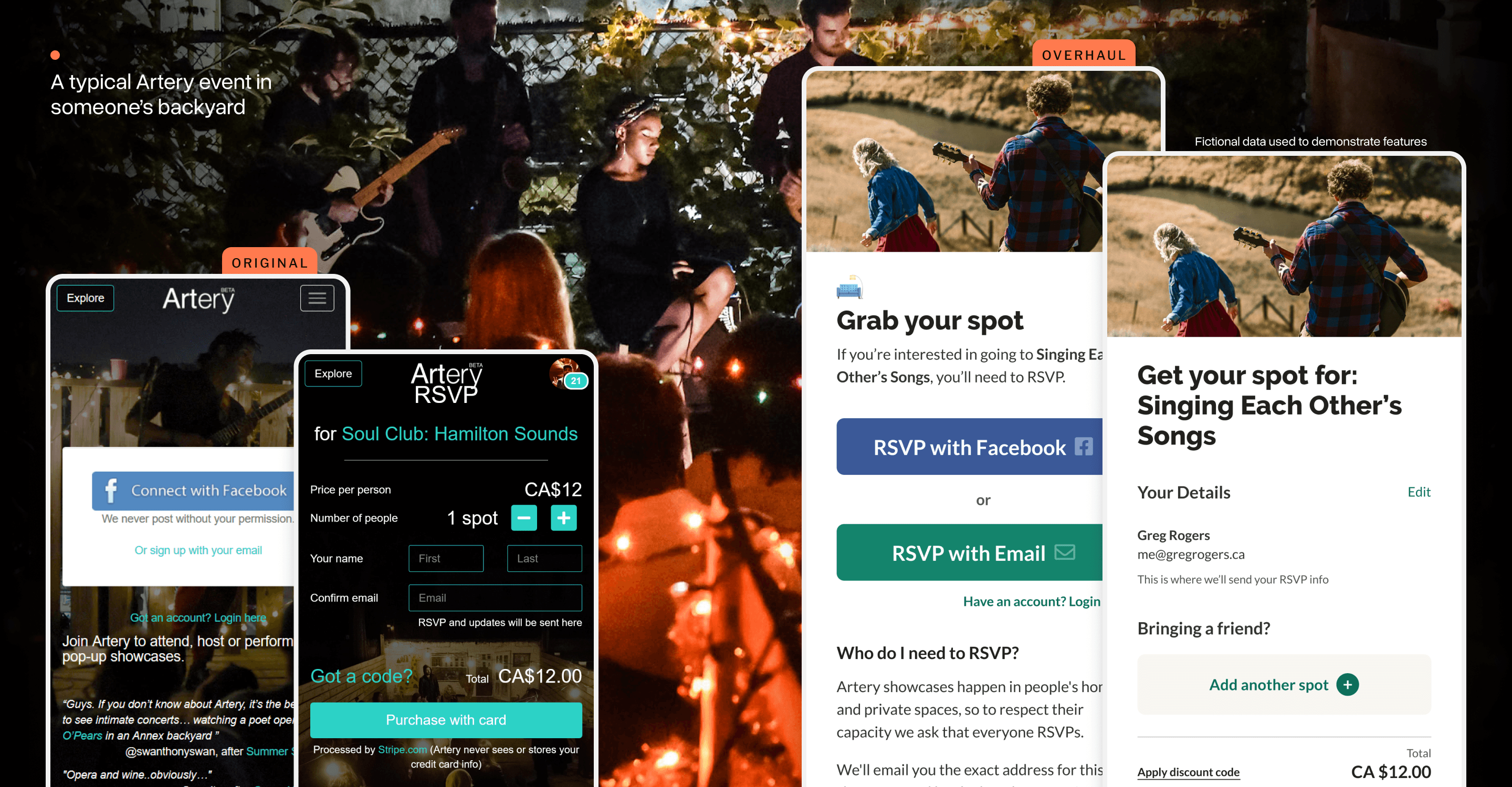
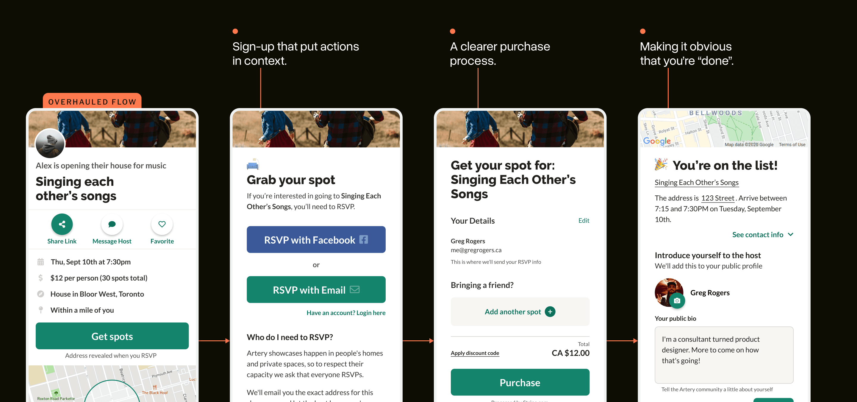
Many people choose to sign-up for Artery in the context of wanting to attend a specific event. Because of this, there’s a common flow each visitor goes through:
(1) Attend, (2) Join, (3) Purchase, (4) Get the address.
Artery events usually take place in someone’s home, so it’s important that all potential attendees go through this process so that the host can know who’s coming and keep their address a secret.
The current flow on the platform needed to better explain each of these steps while also making them easier to use.
Building a more inviting sign-up page
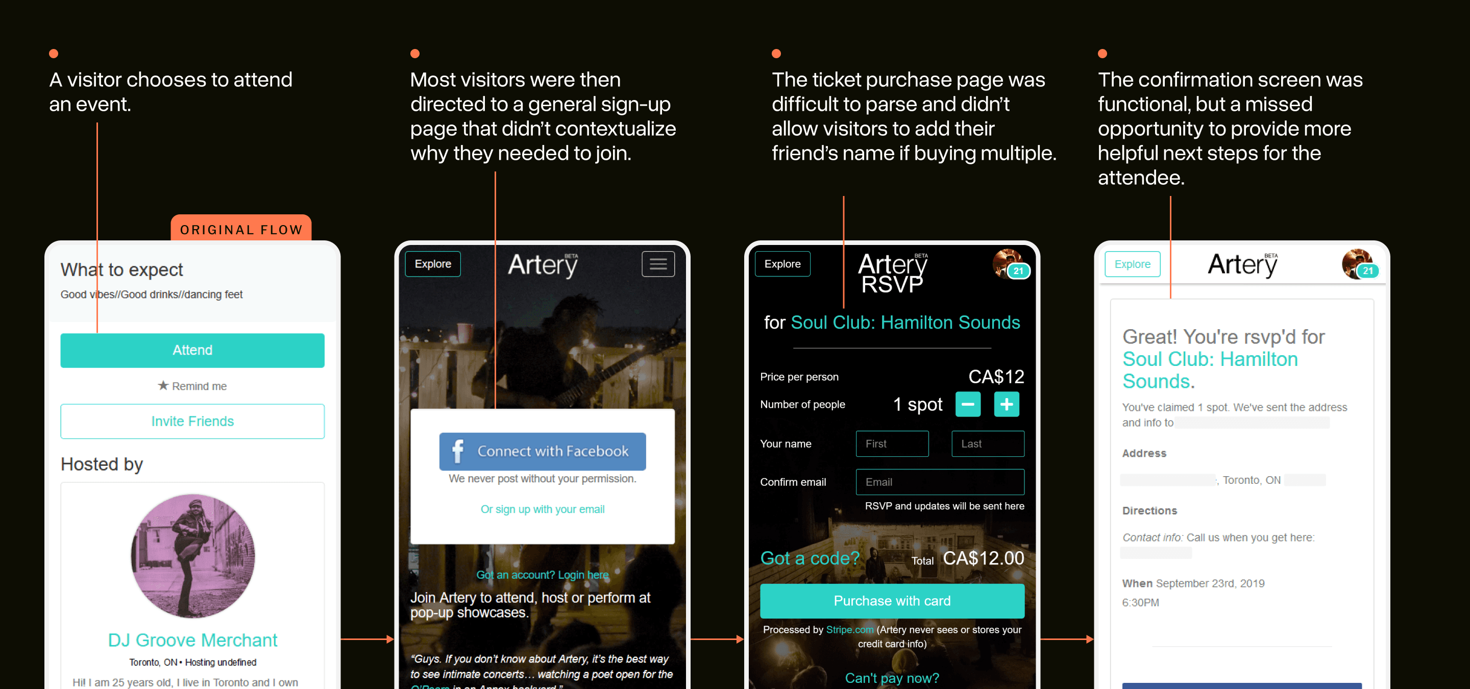
The sign-up page was often where visitors started, so we tackled re-designing it first.
There were a number of usability improvements I made: bringing it into Artery’s new design system, providing clearer inputs, and better buttons.
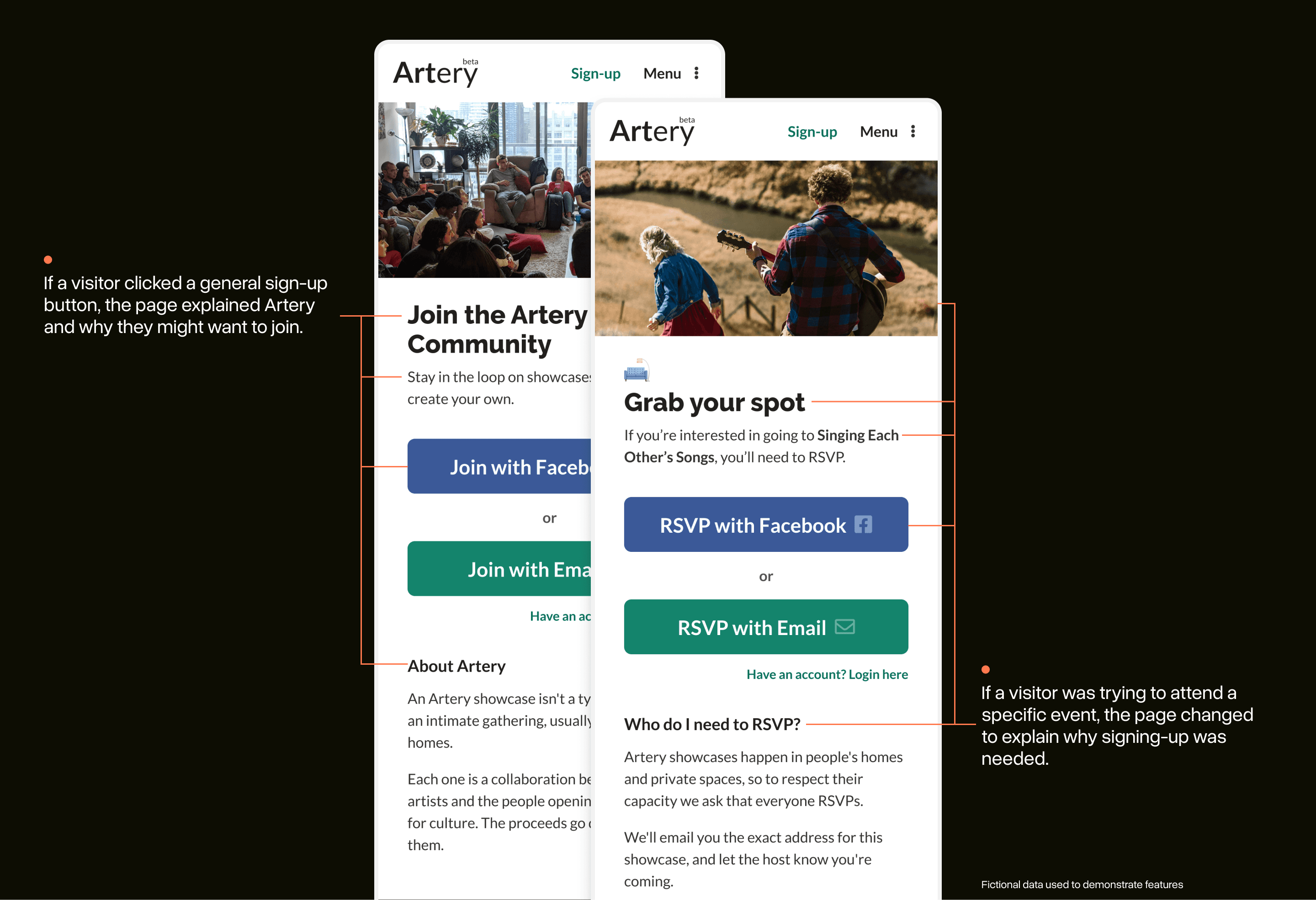
The more interesting addition, however, was the ability to make the sign-up page dynamic. The image, titles, buttons, and explanation text could be swapped out depending on the visitor’s context.
For example, if someone wanted to attend an event, the sign-up page would feature info about that event specifically.
Making it easier to bring your friends
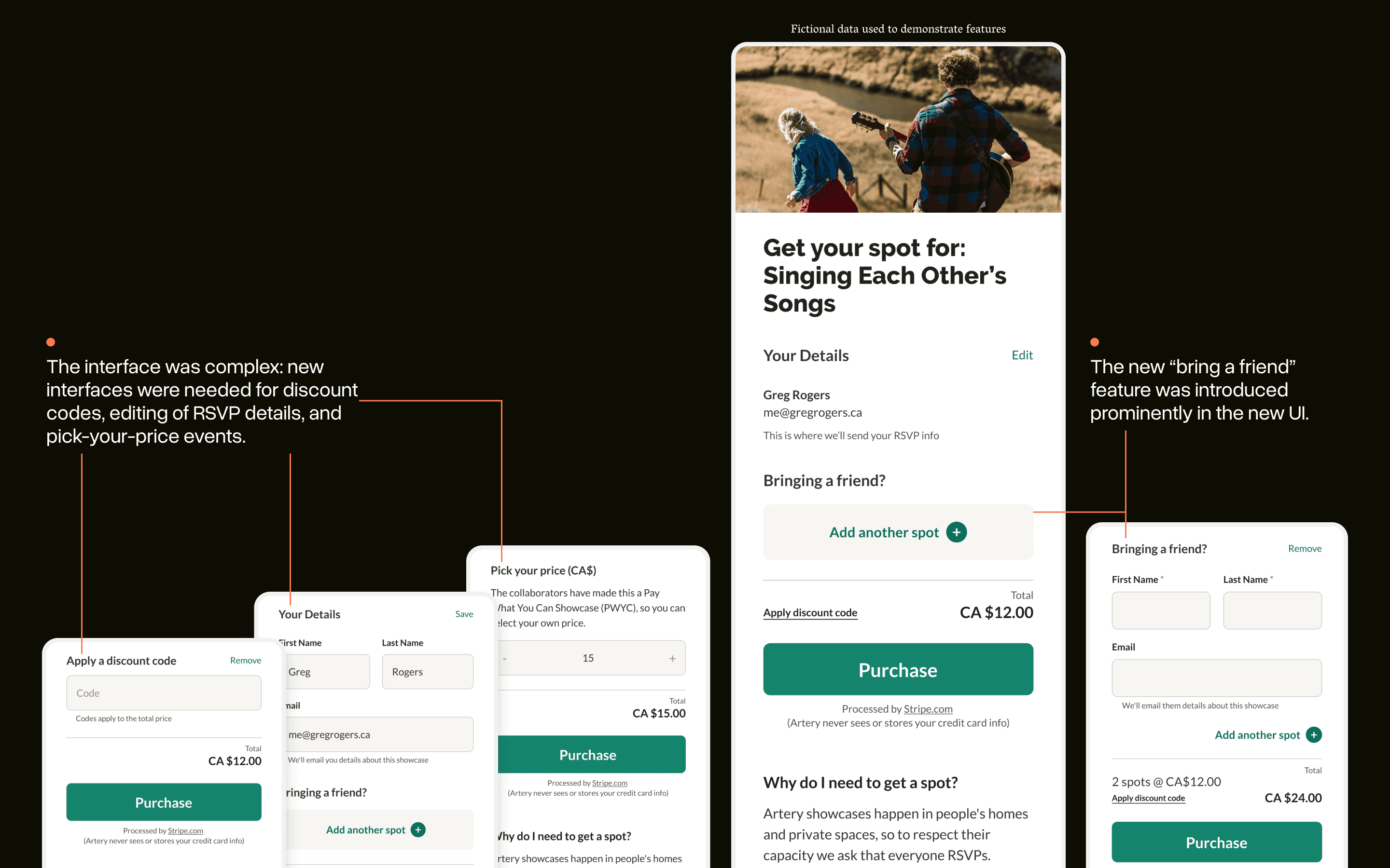
The ticket purchasing page also received a significant look and feel upgrade. We also knew that we needed to make it easier for people to invite their friends.
We built the new page around this feature. Allowing for “+1’s” meant that hosts would have a better idea of who was attending while guests get the address and updates sent directly to them.
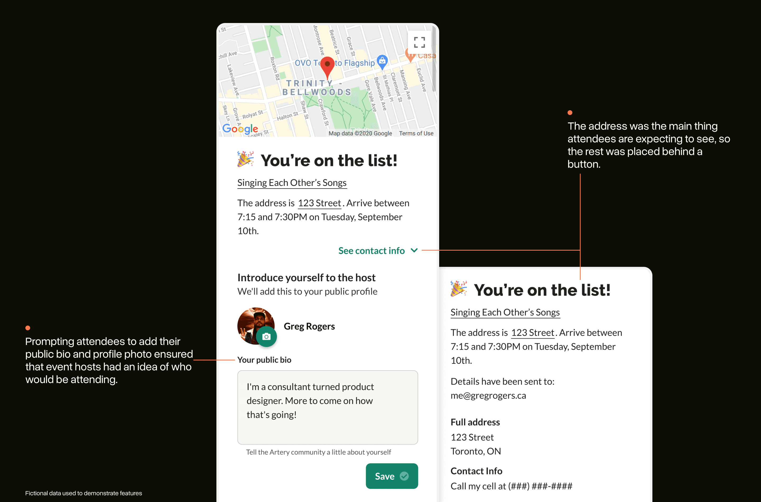
Knowing the details of your RSVP
The exact address for each Artery event is a secret until you purchase a ticket, so getting to this point had to be an exciting one for new attendees.
The new interface had to do triple-duty and was a challenging UI problem to solve:
Let the attendee know they are “done”
Give them important info they will likely refer back to later
Provide a chance to introduce themselves to the community and update their public bio.
The final design kept learning about the address as the focus and encouraged adding a photo and bio below.
A simple flow, with many states to consider
Artery visitors needed more context for why each of these steps were necessary. These three projects ensured that this flow on the site wasn’t a place where we would be losing people.
Although the new flow itself is seemingly simple, hidden behind the scenes are dozens of potential states: types of payment, adding guests, etc. As this flow was re-designed, the Artery development team found new skills around dealing with the complexity that these sorts of interfaces demand from a team.
This project wouldn't have been possible without the help of the Artery team. Thank you to Artery Co-Founders, Salimah & Vladic, for guiding the project, and Zach + Brendon + John for laying it down in code and approving my PRs.
Imagery from Artery events are not my own: each was taken by an Artery team member and is owned by Artery.