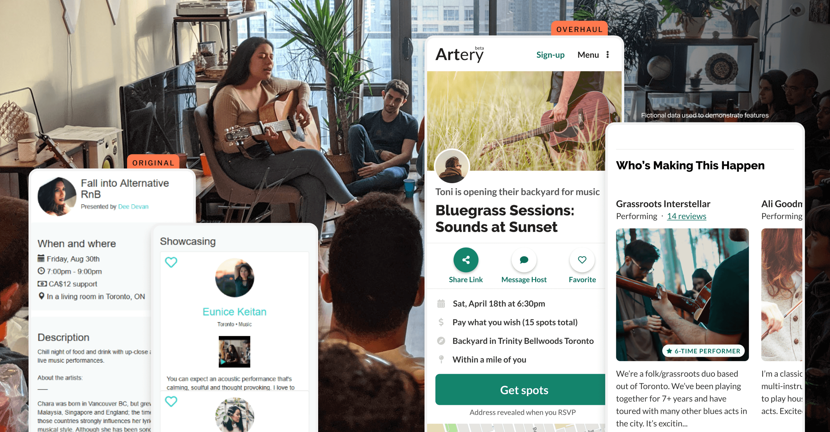
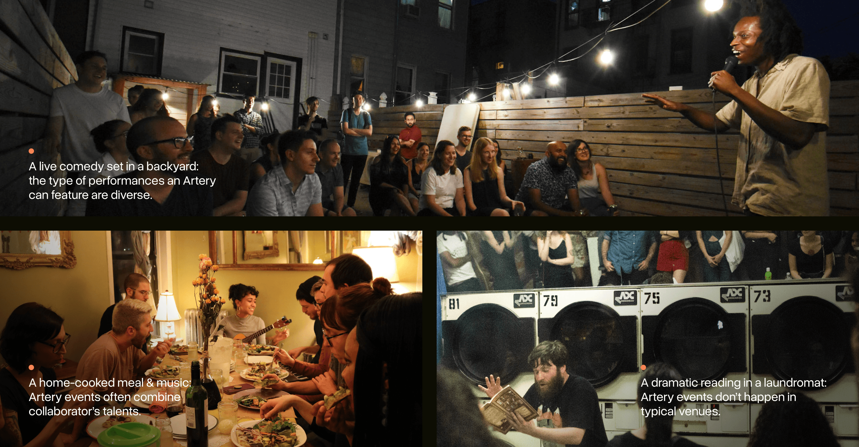
Artery is an arts and culture organization with a unique premise: giving people the tools to organize intimate cultural events in their home. Think folk music on someone's rooftop or a poetry slam in a living room.
The pages that advertised these unique events needed an overhaul to help people understand the premise right away and make them excited to attend.
I led the design of the project from conception through to implementation; setting a new high-water mark for the product's look and feel along the way.
More than "another event"
Going to an Artery event is unlike any other, but the event pages used to advertise them didn’t make this obvious.
Visiting one of these pages is usually someone’s first interaction with Artery, so they had to:
Help visitors instantly understand the Artery premise
Quell uncertainties they may have about attending
Still communicate essential information clearly
In blunt terms: a new design had to demonstrate how this wasn't just “another event”.
Taking apart the current page
When Artery started, the event pages were one of the first things to be built and it had been a while since they had been re-examined.
I started by taking apart the current design: getting a sense for the various pieces and the challenges they posed. I then worked with the founding team to better understand what we might change, keep, and throw out.
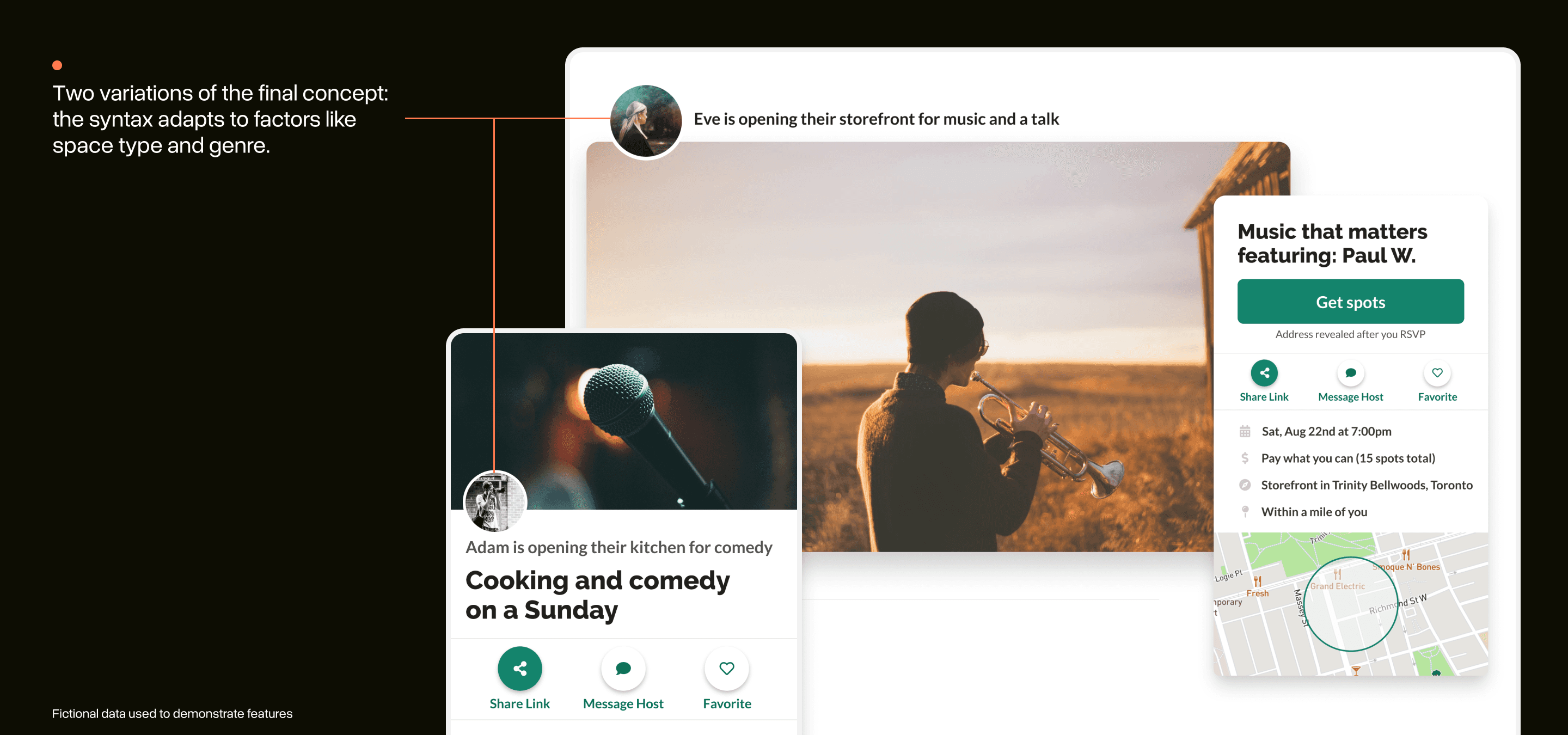
Same, same, and a little different
It was important for the layout of the new pages to feel familiar on first glance and then slowly subvert visitor’s expectations as they saw what made these events unique.
I did a UI analysis of other platforms offering a time-bound product to find a familiar layout to use.
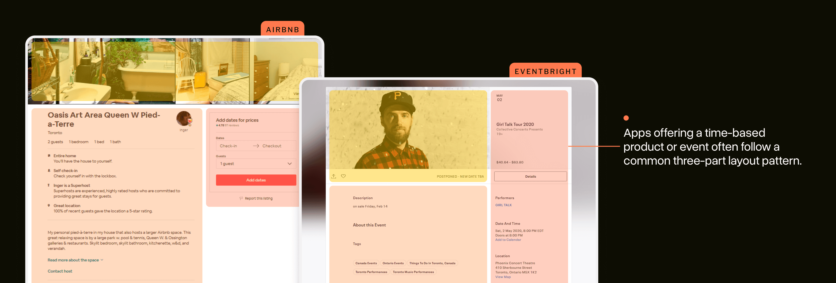
I borrowed heavily from this three-part approach for the final layout and then allowed the other components to do the heavy lifting of showing off what was different about Artery events.
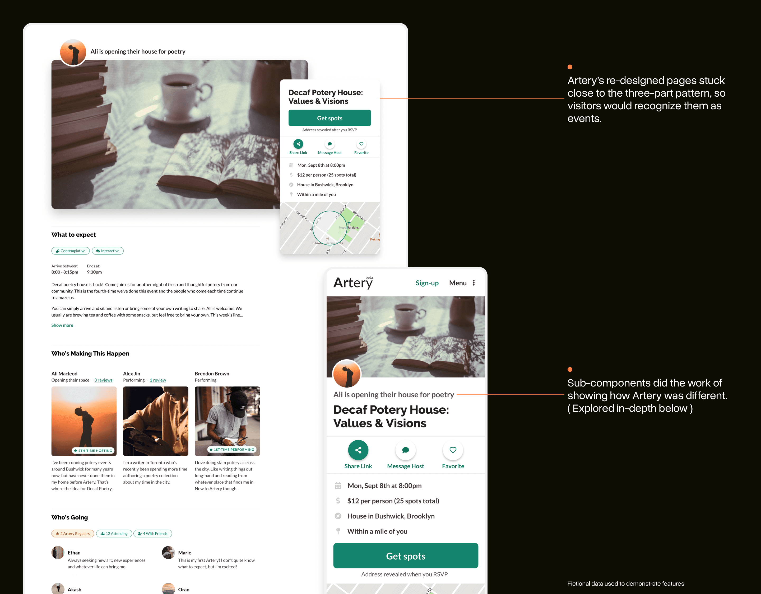
The stories behind each part of this final layout are explored in the next three sections.
“But, what if there weren’t any titles?”
Artery events have a "mad-libs" quality to them:
“{ someone } opens their { cool space or home } for a { unique cultural experience }.”
Early on, the team wondered if we could drop traditional titles for these “mad-libs” phrases. Our hope was these might help users come up with better titles for their events.
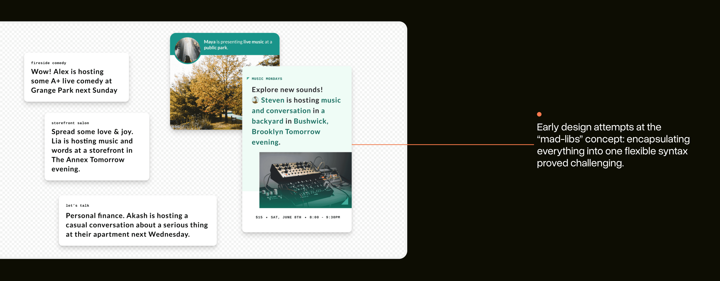
Design explorations of the idea were cool, but they got wordy fast as we tried to cram as many details as we could into the phrasing.
The final design kept a small element of this concept, emphasizing that Artery events happen in people’s homes rather than a traditional venue.
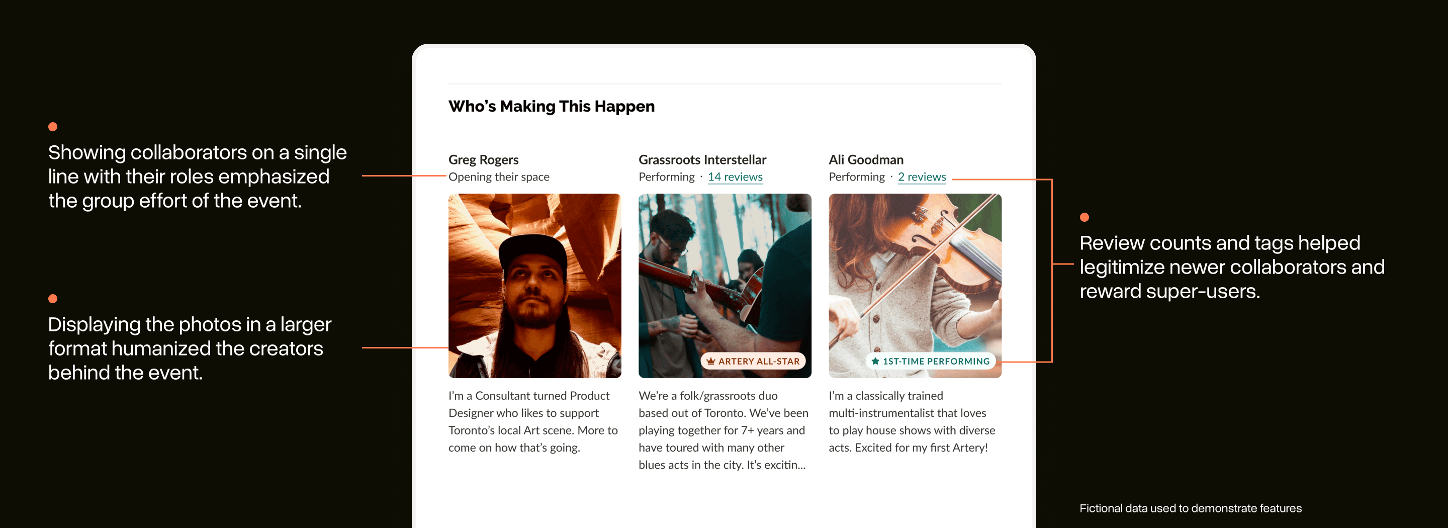
Giving collaborators the spotlight
Artery events are made unique because they emerge from a host and performer connecting through the platform. Rather than the traditional venue booking model, Artery can facilitate direct connections between collaborators.
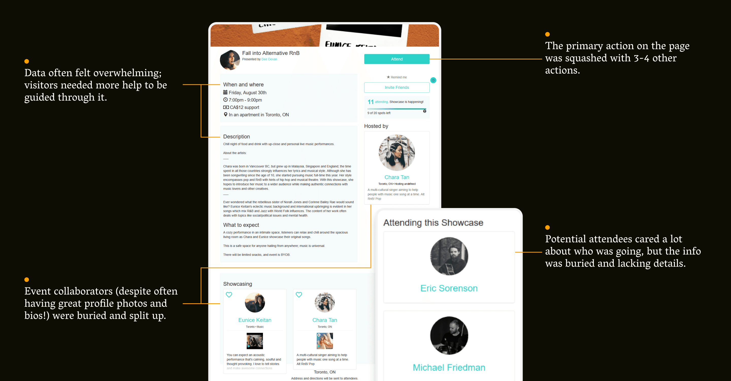
The “Who’s Making This Happen” section was built to emphasize this shared ownership: by organizing all the collaborators together (regardless of their role) and using components that brought important info like their bio, profile photo, and involvement in the community to the forefront of the page.
Attendees are at the event to meet the host and see the performers, so it was important for this info to be featured prominently on the page.
Easing uncertainties about attending
The unique nature of Artery events is one of their best qualities, but it can also provoke a lot of uncertainty for a new visitor seeing one for the first-time.
We had heard often from new attendees that they were unsure if an Artery event was “for them”: they may be unsure of the vibe of the event or if it’s okay if they don’t know anybody who’s attending.
There are also more practical concerns around allergies and accessibility that might discourage someone from attending.
The “what to expect” and “who’s going” sections of the new designs were built to specifically ease some of these concerns.

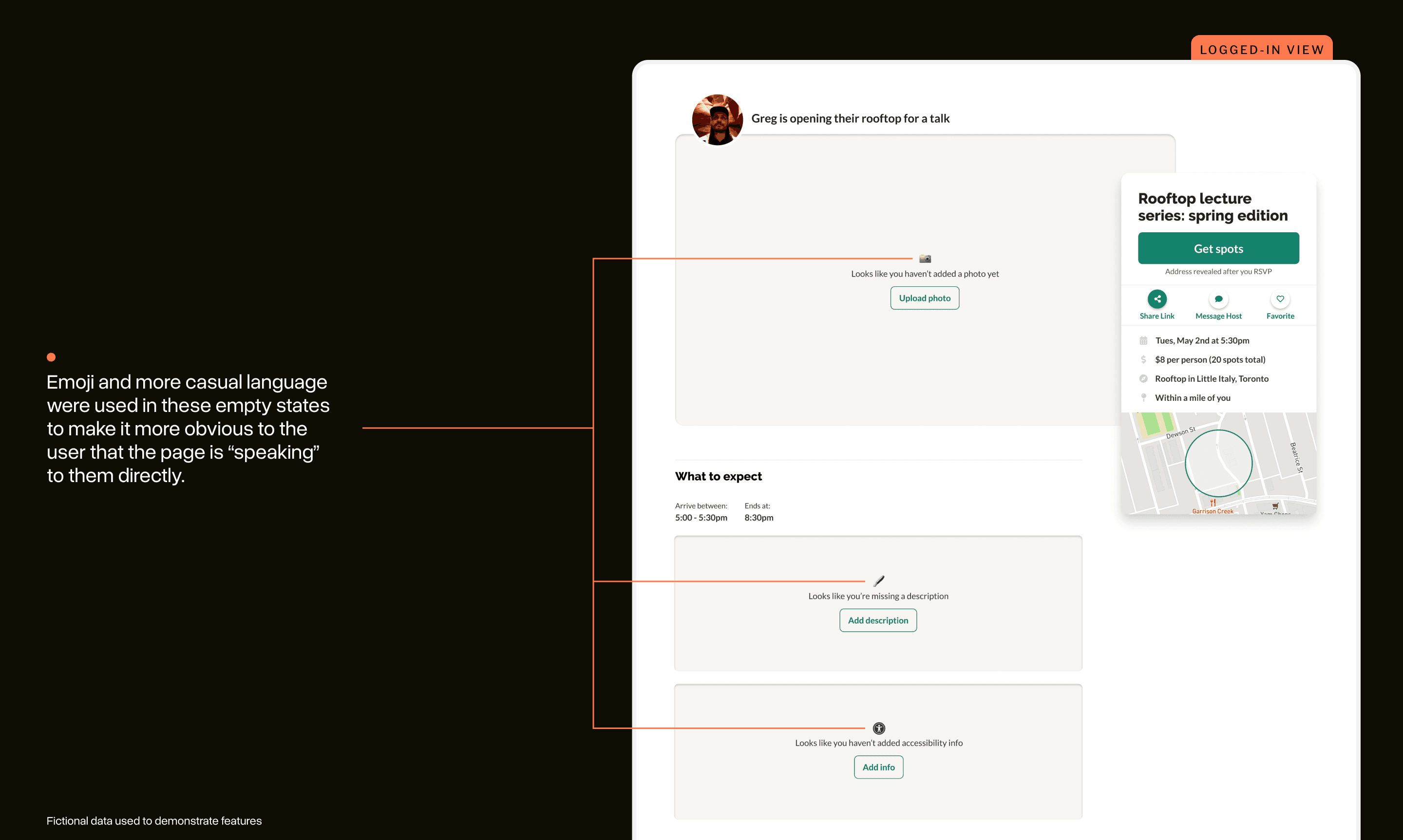
Making it easier to fill out the new pages
If there was ever a rule to live by in UI-design it would probably be: "have you thought about the empty states?"
Designs always look great when they are populated with high-quality information. Less great when there’s nothing.
There’s a lot of information for event creators to keep track of and previous designs relied exclusively on a “manage” page to allow editing of this data: leading to a lot frustrated flipping back and forth to preview changes.
In the new design, if a collaborator is logged-in and is looking at their page, they will see important call-outs for information they might be missing. They can then edit this info right on the page and see their changes live.
This helped nudge first-time collaborators towards creating quality event pages by giving them a sense for what they needed to do next.
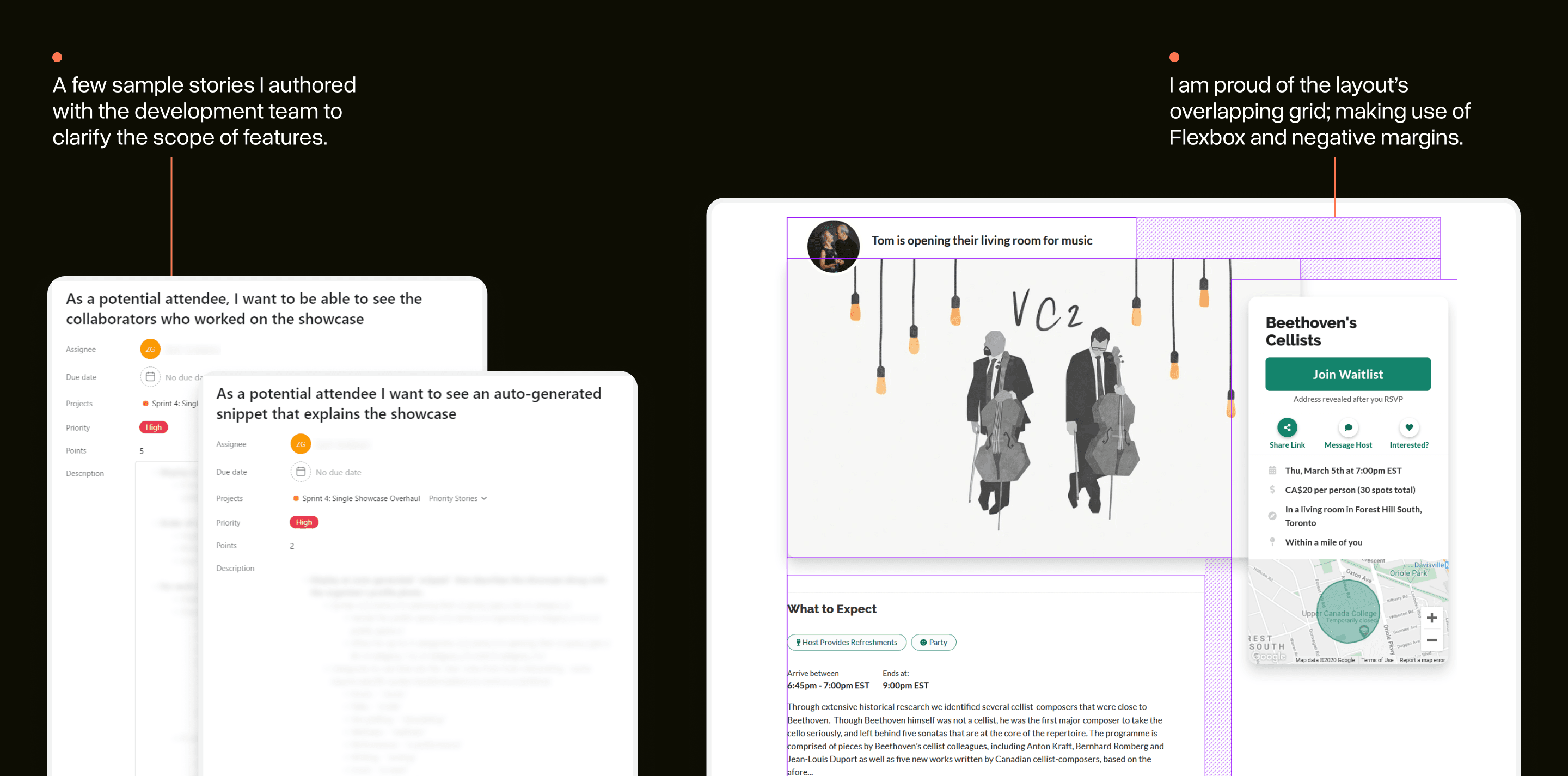
Coding (& managing) the final implementation
I tend to reject the traditional design-to-development hand-off process in favour of a more integrated and cooperative approach.
On this project, I was deeply involved in the implementation of my final designs. I coded the HTML/CSS template for the page that was used by other developers for bringing it to life.
I also wrote and managed the user stories used to describe the scope of each feature. Along the way, I worked directly with the Artery development team to clarify and refine the nature of these features as they were being implemented (I implemented a few of the smaller ones myself).
Design as a multi-layer cake
On the surface, this was a straight-forward overhaul project focused on solving basic usability challenges with the previous design (along with a few new features!)
In practice, this simple effort forced our team into a “multi-layer cake” of problems and outcomes:
As the first in a series of re-designs, decisions around buttons, typography, and spacing were happening for the first time: kicking off Artery’s first design system.
At launch, Artery was helping organize over 100 events a month in Toronto alone: it was a design that needed to scale to a much wider set of use cases.
Our product development team grew quickly during the project, requiring us to professionalize & integrate our process for design-to-development hand-off.
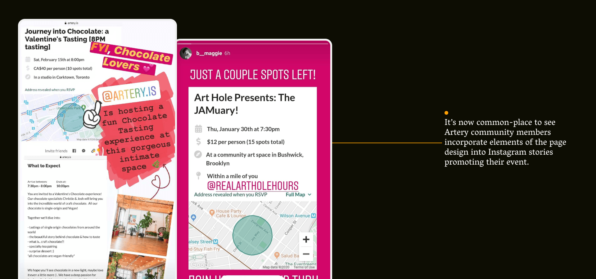
The final product was a significant step forward for a single feature on the platform and it became a talisman for what the Artery product team was now capable of.
This project wouldn't have been possible without the help of the Artery team. Thank you to Artery Co-Founders, Salimah & Vladic, for guiding the project, Design Researcher, Minnar, for keeping me honest about what people were looking for, Kim + Sterling, from the ops team, for the amazing imagery, and Zach + John for laying it down in code and approving my PRs.
Imagery from Artery events are not my own: each was taken by an Artery team member and is owned by Artery.