Artery is an arts and culture organization with a unique premise: giving people the tools to organize intimate cultural events in their home. Think folk music on someone's rooftop or a poetry slam in a living room.
The interfaces for discovering events on the platform were used rarely. They needed to better reflect the factors visitors were considering when deciding to attend an event.
I led the design of project which included assisting with a small user research study to test early concepts, iterating on the core feature set, and implementing my final designs in code.
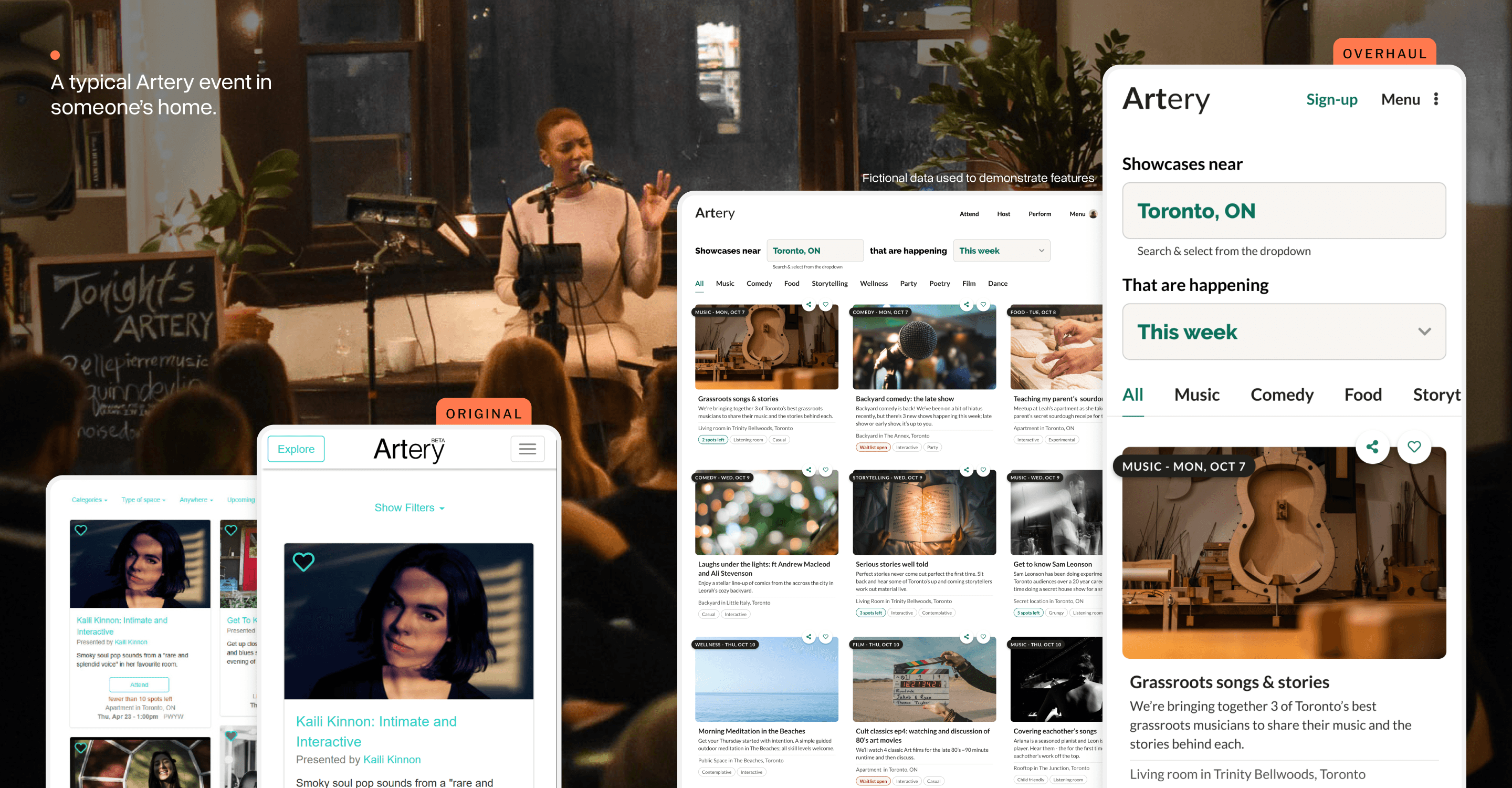
Discovery beyond the email newsletter
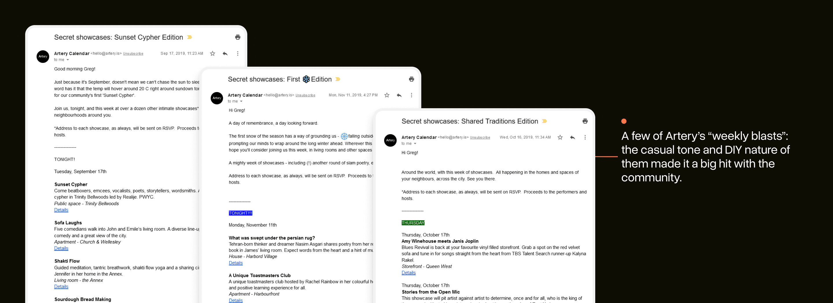
Artery members get added to Artery’s “weekly blast”: a hand-written newsletter covering events happening in their city that week. It’s popular and – for many – was the primary way they heard about these events.
A new discovery interface for Artery events had to provide an experience that was different than a (very!) well-loved newsletter.
This new interface needed to:
Compliment the newsletter
Provide browsing based on factors people cared about
Demonstrate the diversity of Artery events
Finding the big discovery challenges
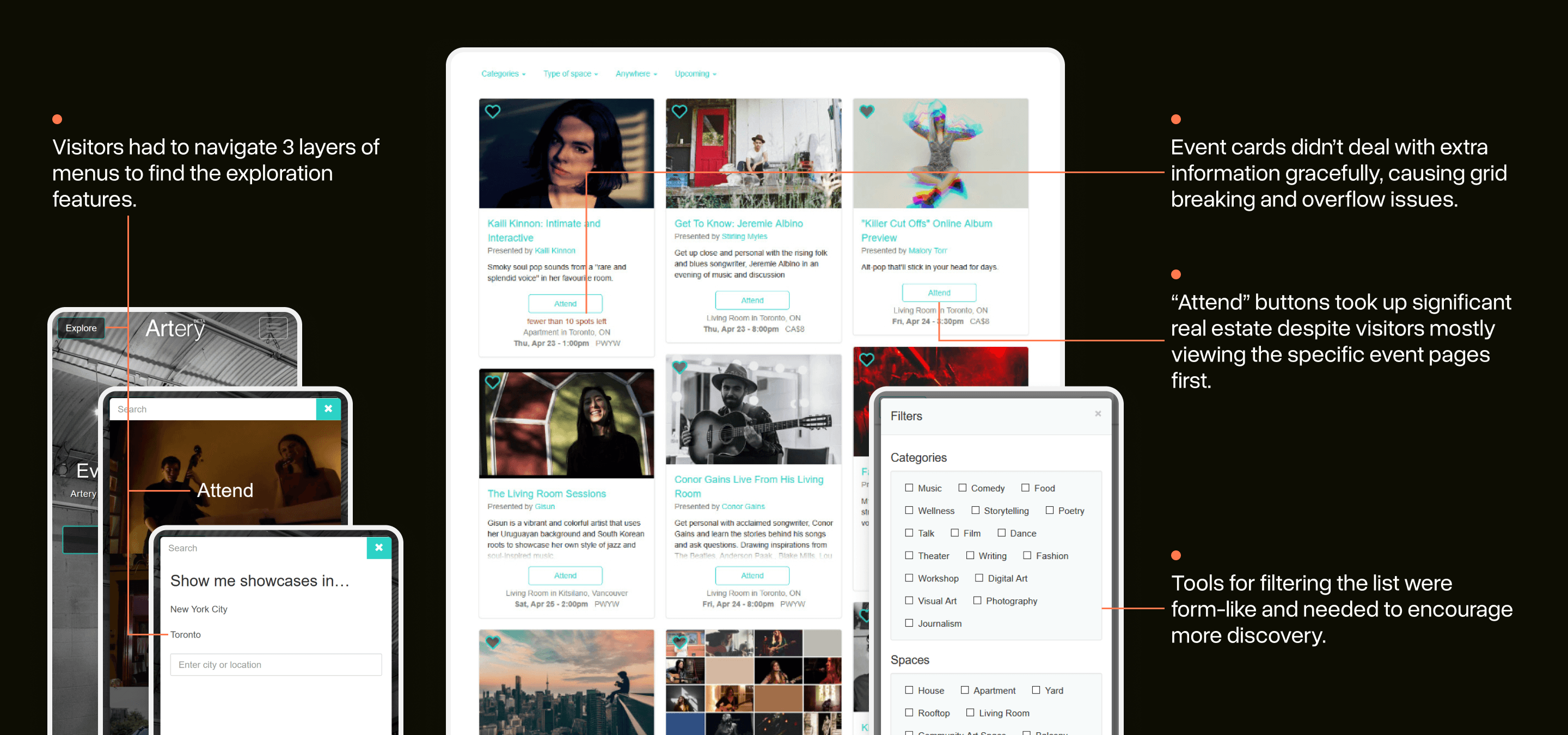
Assessing the current page for exploring events made some challenges clear. Finding it was a multi-step process: reducing discoverability significantly.
Our team also had a hunch that the filtering tools provided were not representative of the real factors people considered when browsing for an event to go to.
Testing concepts with the Artery community
We needed to know what factors mattered most to Artery users when deciding whether to attend an event. I worked with Artery’s design researcher, Minnar Xie, to assemble prototypes for a small research study on this question.
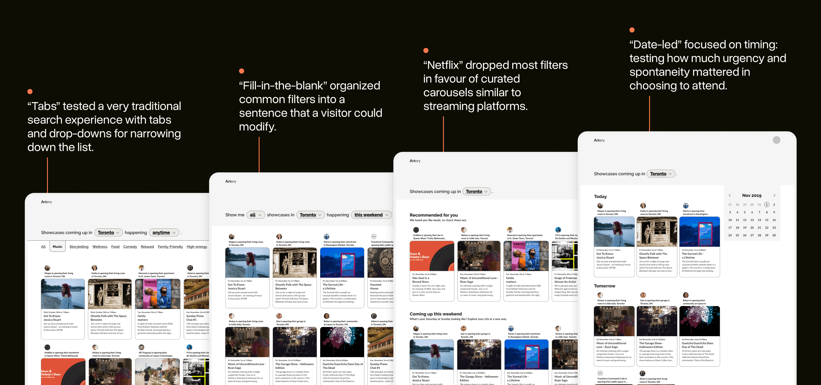
Based on a previous research study about attendance, we had some early hunches for what factors to test.
We wanted these prototypes to look ‘lo-fi’ to encourage candid feedback, but use real data from our current events to keep them realistic. We also deliberately designed the prototypes to be “extreme”: none of them were a complete solution. Our hope was that this approach would force research participants to compare and contrast them.
Insights that informed the final design
The final research study included 6 people: some had never gone to an Artery event and others had been to 5+. Artery’s design researcher, Minnar Xie, conducted the interviews.
Each interview included discussions of how they decided what events to attend and evaluation of our prototypes.
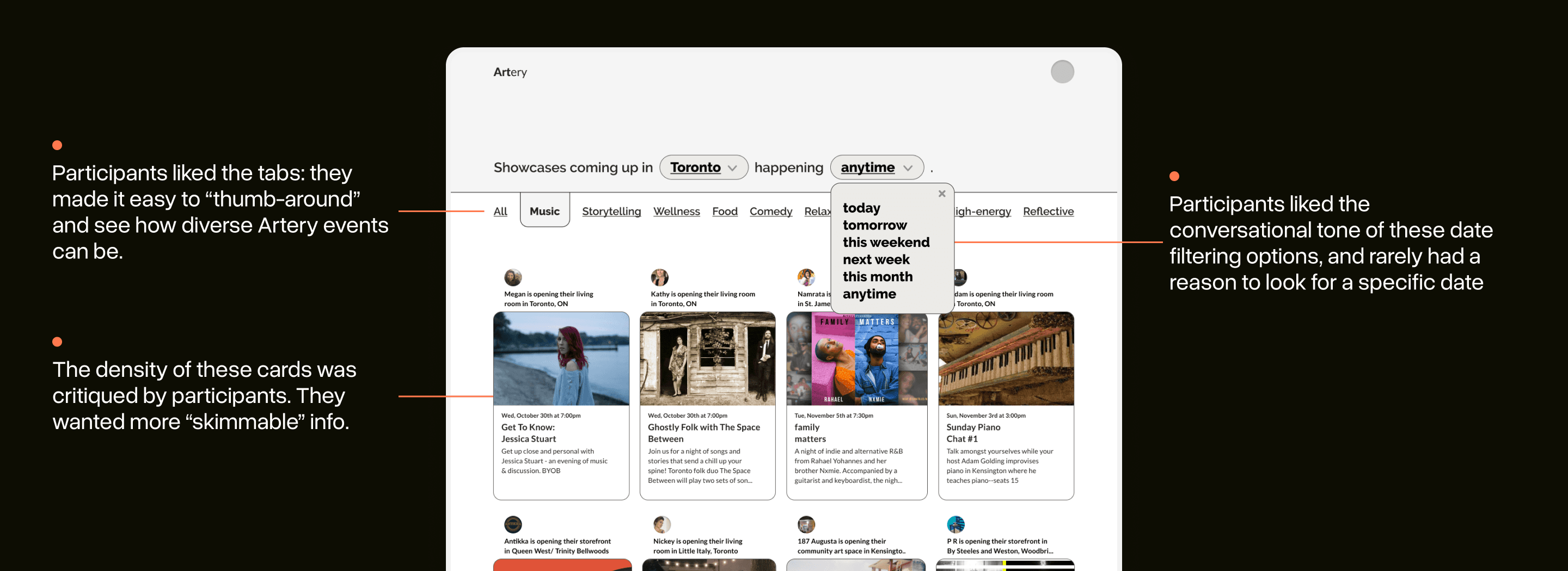
The “tabs” concept proved to be the early favorite: participants liked that the tabs helped visually demonstrate the diversity of events that were happening through Artery. It encouraged them to explore!
Additional UI research of similar interfaces cemented this design as a strong one to move forward with.
Designing the “Atomic Unit”
I took an inside-out approach to the high-fidelity designs, focusing on the “atomic unit” first: the event card.
The final design remains the most challenging component I’ve designed at Artery. There were many potential pieces of data to feature and I had to work with the team to determine which were the most essential.
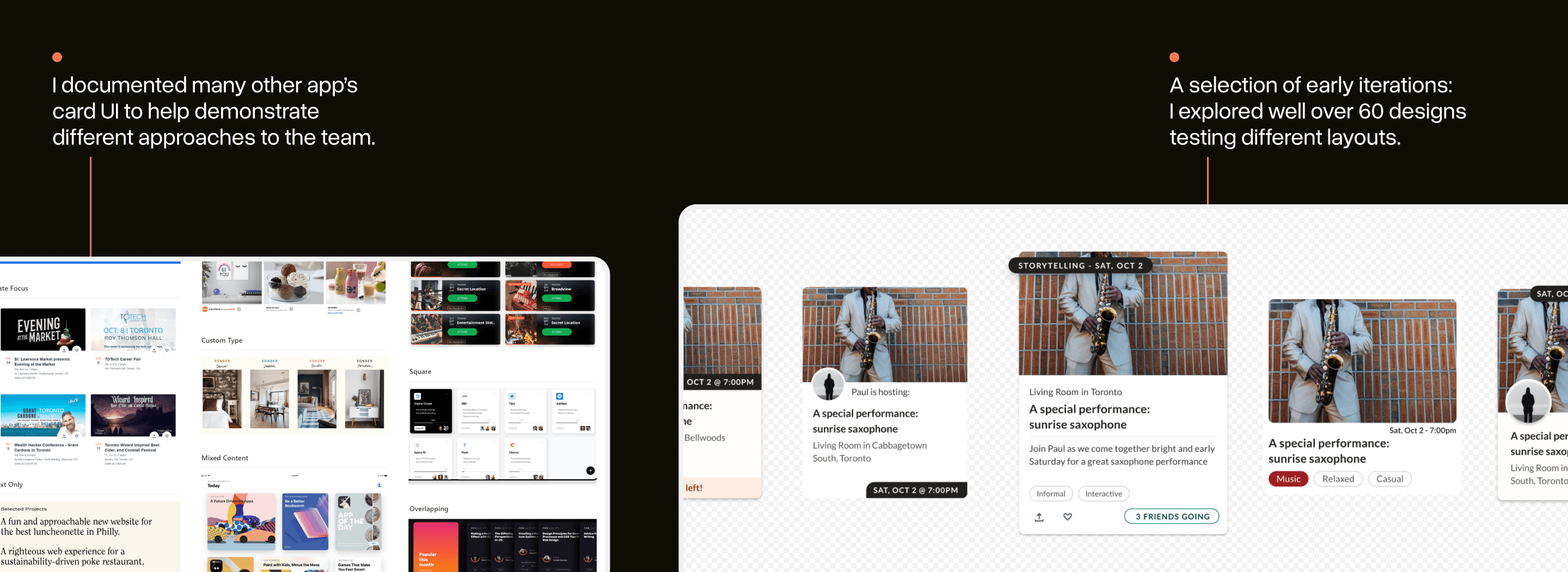
Moreover, given the user-generated nature of Artery’s content, the component had to be extremely flexible. To assist with this, I wired up a Google sheet to Figma so that I could always design with real data.
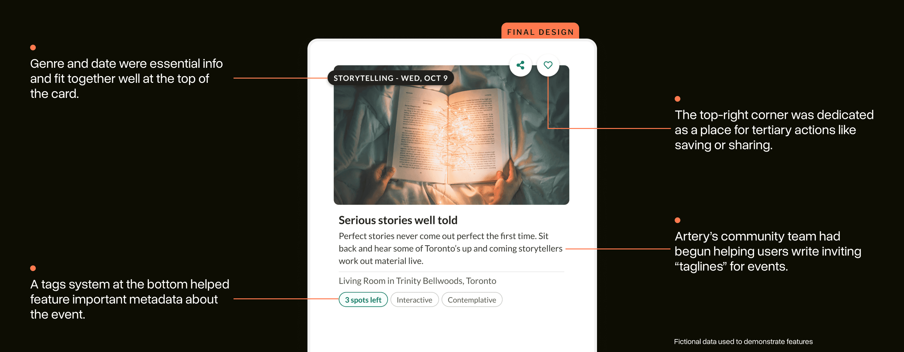
Putting together the final layout
The final layout came together quickly after our research study. The final design stuck closely to what we had heard from the Artery community.
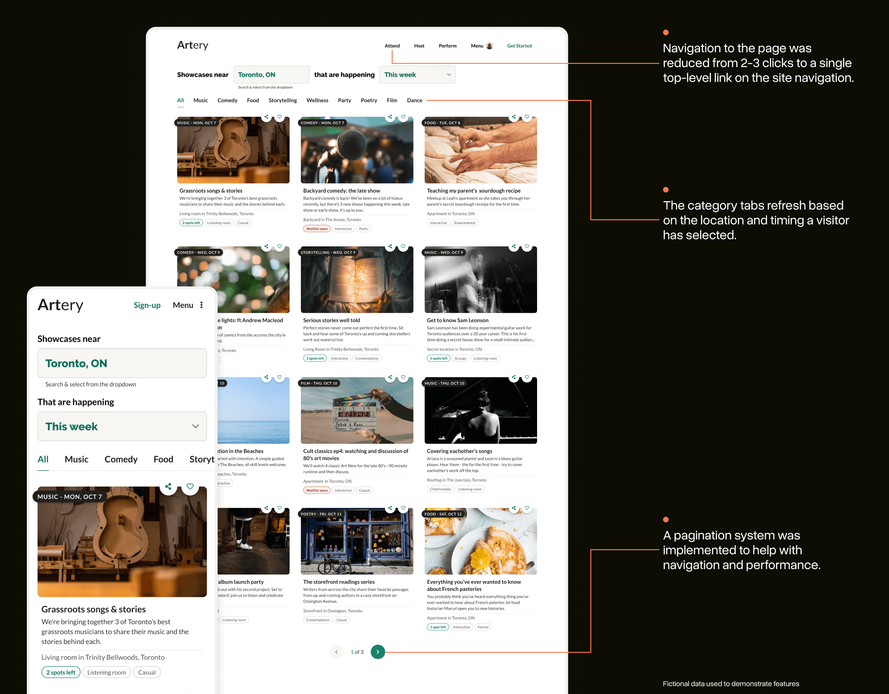
Around the same time we implemented the final design, we also overhauled Artery’s navigation which made the interface much more accessible and prominent.
Like other design projects I’ve done at Artery, I was deeply involved in the scoping and implementation of the final concept: I wrote the user stories used by the other developers and coded the template (and some features) for the page in HTML/CSS/JS.
A project about adapting gracefully
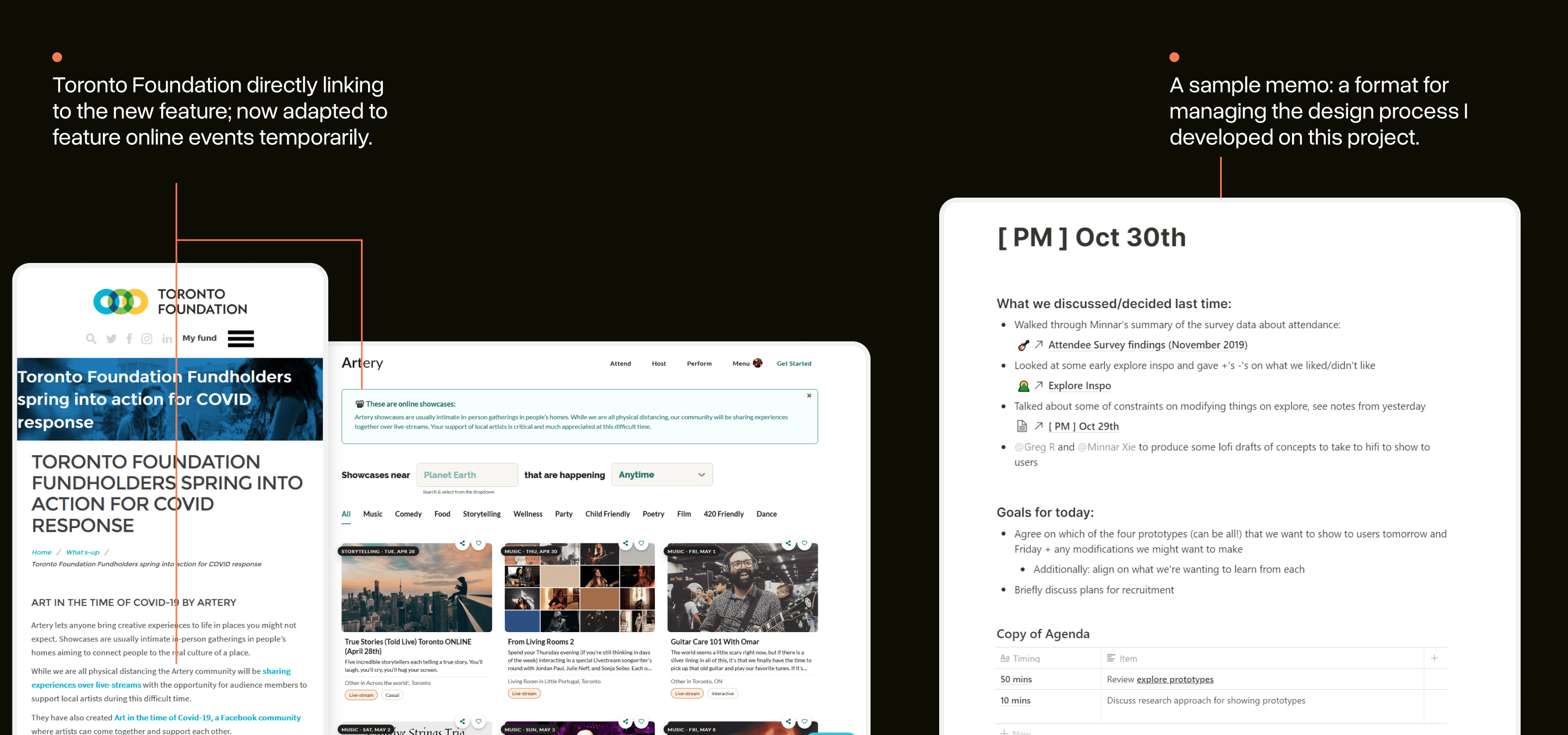
This project had a dual-set of outcomes. For Artery, the new discovery features launched during the (still ongoing) COVID-19 pandemic. The Artery community had just begun to do live-streaming events and the features quickly became a new entry point for visitors.
The flexible card components and search features made it easier to adapt to these circumstances.
Personally, this project was a big step forward in my ability to manage a design process end-to-end.
To help keep everyone on the team aware of all the moving parts on the project, I started documenting decisions in small internal memos and sharing them with the team before meetings. This has since become quite popular at Artery and is used by other members of the team.
This project wouldn't have been possible without the help of the Artery team. Thank you to Artery Co-Founders, Salimah & Vladic, for guiding the project, Design Researcher, Minnar, for guiding & conducting the user research, and Zach + John for laying it down in code and approving my PRs.
Imagery from Artery events are not my own: each was taken by an Artery team member and is owned by Artery.