In 2022, I had a chance to overhaul Top Hat's approach to colour, implementing a much more modern tokens approach that gave us both (1) granular control over styling on the platform, and (2) built-in colour contrast for accessibility.
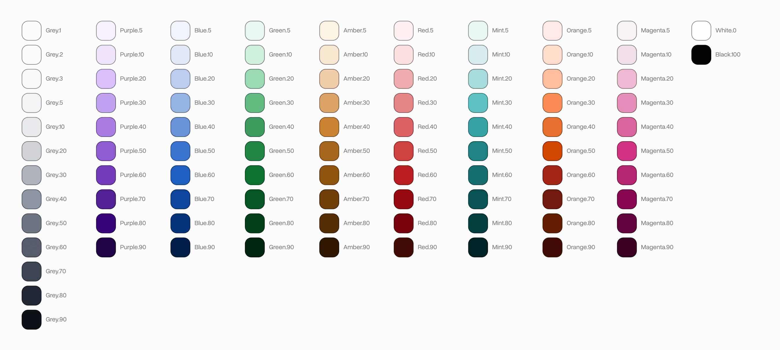
I started by establishing a set of colour scales. Many more basic colour systems just stop here and use these directly, but for this system, these were just an initial foundation to build on-top of.
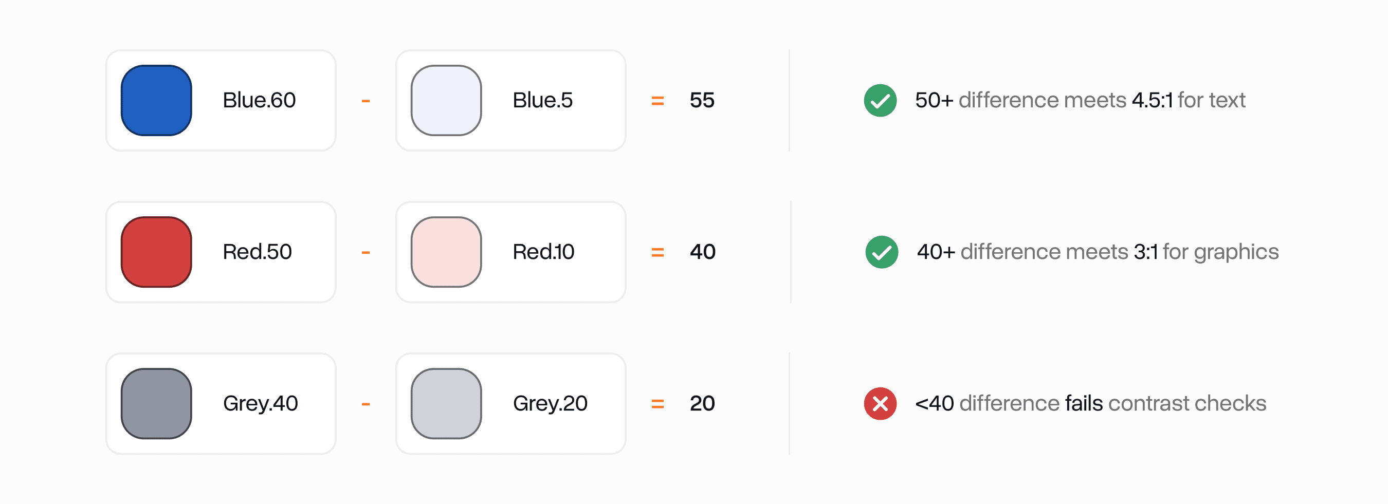
I wanted to build accessibility right into the base layer of the system. I was heavily inspired by WSWDS' approach to this where each colour gets number grade which puts it in a certain range of relative luminance.
If all colours follow this system, you can do simple math on any two colours to determine if it passes WCAG 1.4.3 AA or not.
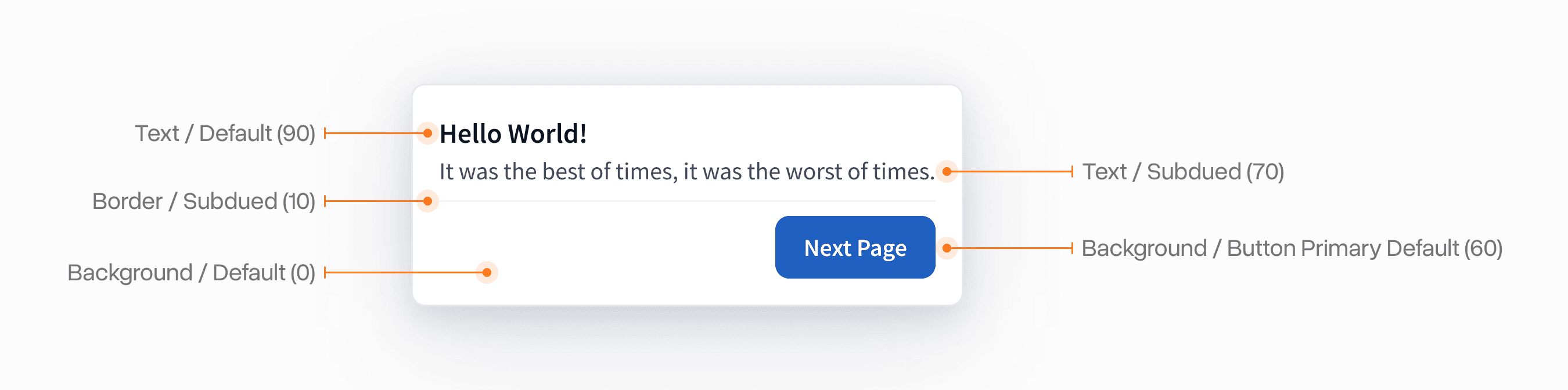
These scales were then used to produce semantic colour names for specific purposes. This enabled us to get granular control over them for things like marketing, school colours, dark mode, etc.
All the colours followed a consistent semantic naming convention that was heavily inspired by a mix of the base approach style dictionary uses and Shopify Polaris' approach.
The core idea is all tokens should indicate semantically what they do in an interface for each application.
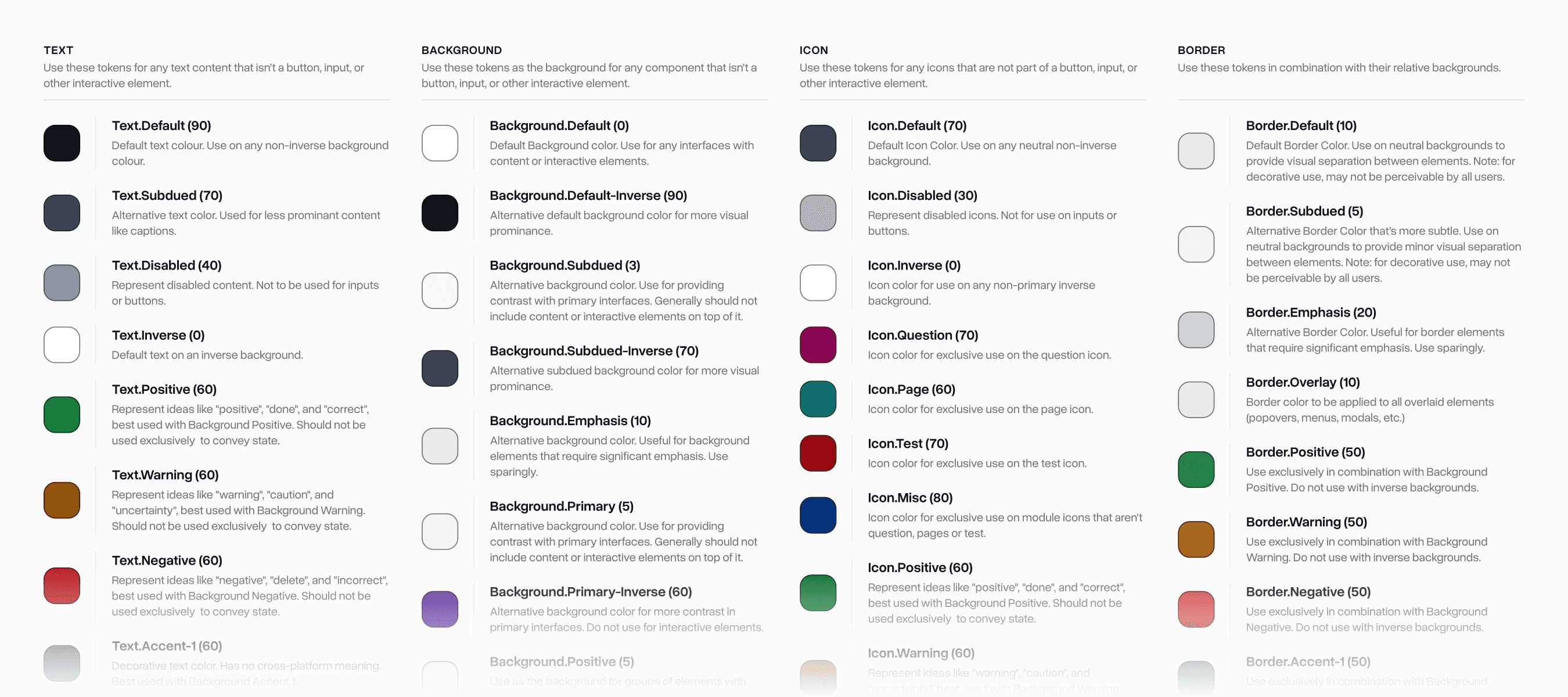
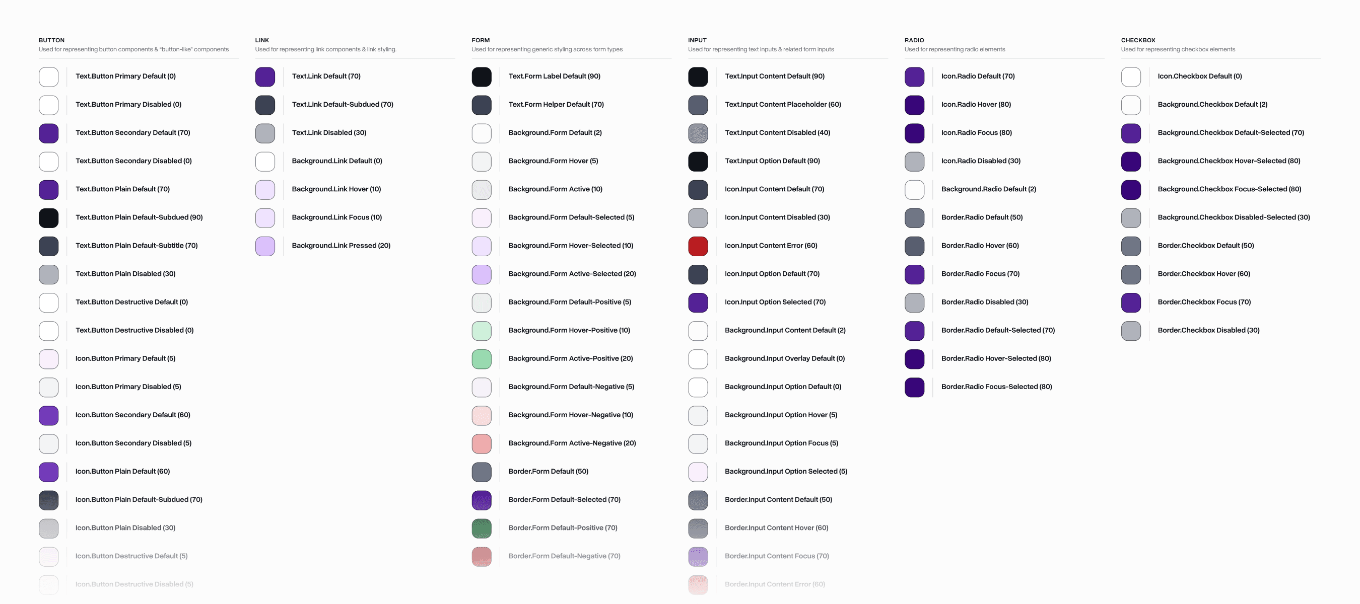
We had a second class of "interactive" tokens which were used for more granular purposes like buttons, forms, links, etc.
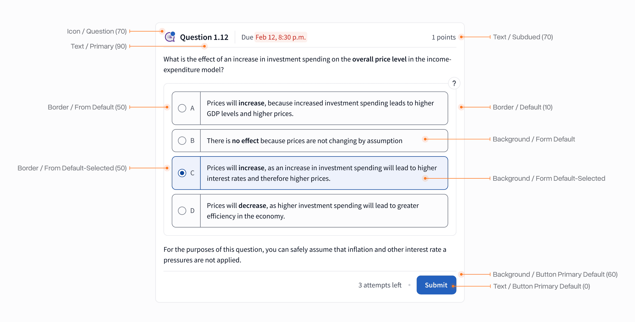
The final system enabled our team to quickly, accessibly, and semantically apply these tokens to any interface they are working on. Over 1-2 years we refined the exact token stack based on feedback from real-world usage.
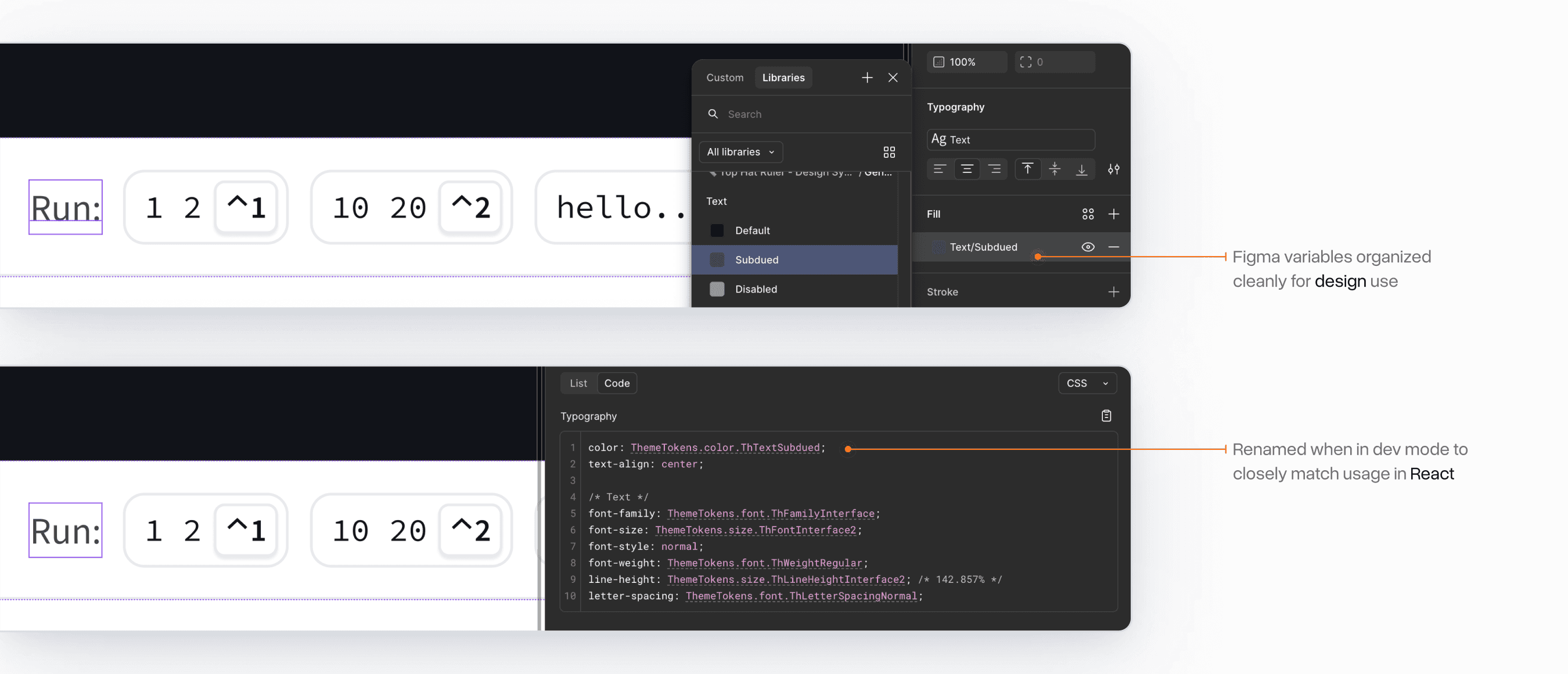
The system was built to be functional both for designers and engineers. The Figma Variables implementation kept things short and to the point to meet designer's expectations.
For engineers, we utilized Figma's Code Connect feature to provide quick code snippets that matched how you would access these tokens in React.
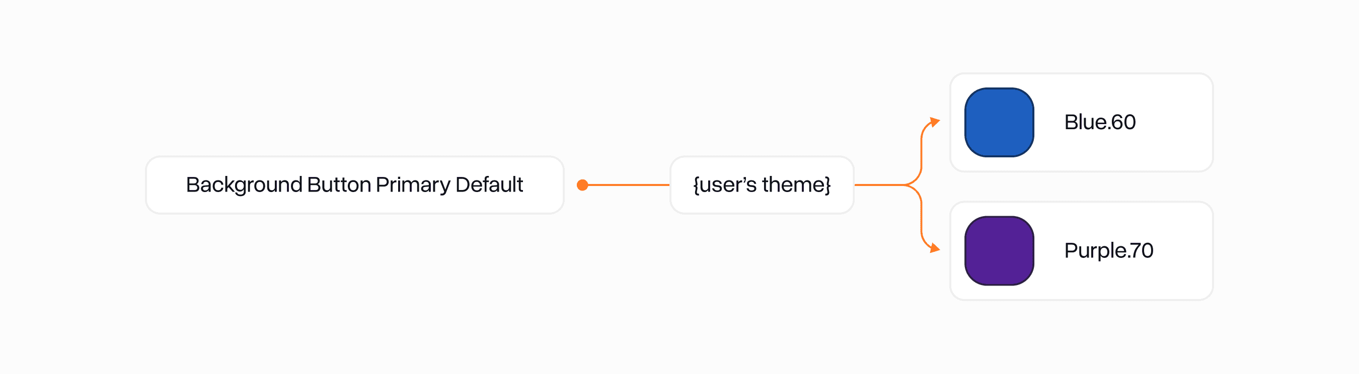
The final system remains the baseline of Top Hat's visual design today. One of the coolest features is how easily themable it is using CSS variables. This allowed us to very quickly migrate TH's legacy Blue design to a more modern Purple design that matched our brand colours.