Artery is an arts and culture organization with a unique premise: giving people the tools to organize intimate cultural events in their home. Think folk music on someone's rooftop or a poetry slam in a living room.
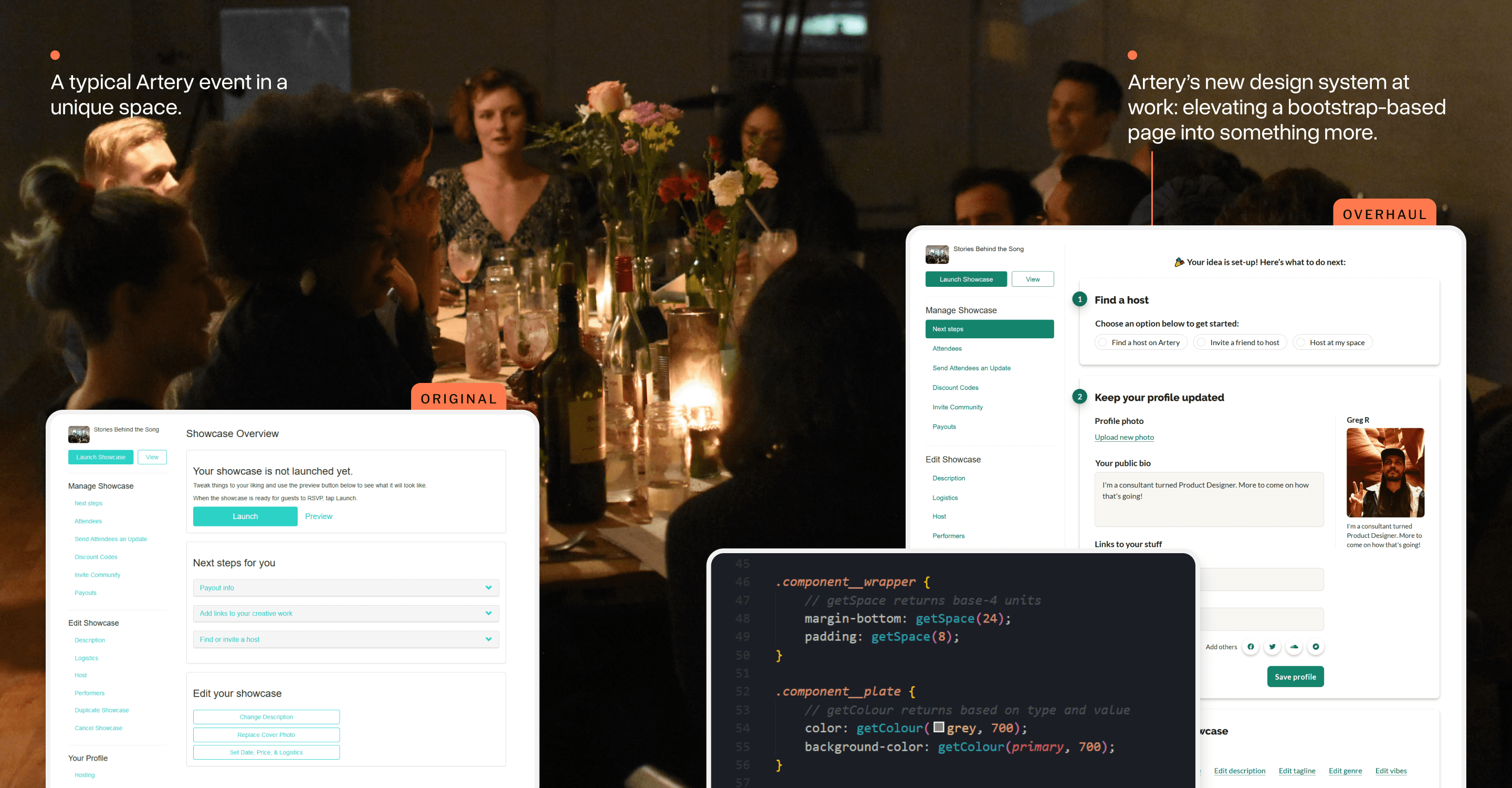
Artery was able to iterate quickly in the early days using a standard set of Bootstrap 3 components, but new feature demands meant a more purpose-built design system was needed.
I led an early design exploration for the new system and saw it through to its implementation. Across many projects, the look and feel of the system evolved and helped our product and development teams move faster.
Choosing to move beyond Bootstrap
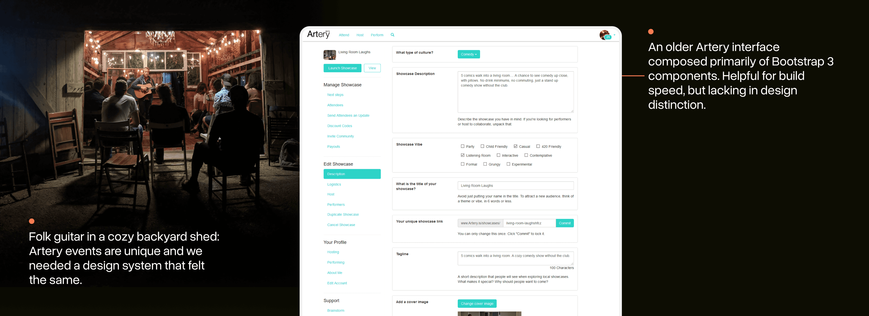
When Artery was first started, Bootstrap 3 (a popular UI framework) was used to quickly iterate on features and get the main parts of the app working.
In my early days at Artery, a team member joked with me that we had made use of almost every component in the framework! Bootstrap gives you speed, but you give up a lot of creative control and design differentiation.
Artery needed a design system that was as unique as its premise and as easy to use as Bootstrap.
“Design systems” are often invoked as a solution for larger teams trying to standardize design. For us, the benefit was going to come in iterating speed: we could “make less decisions” and keep the bar for design quality high.
Finding all the use cases in-play
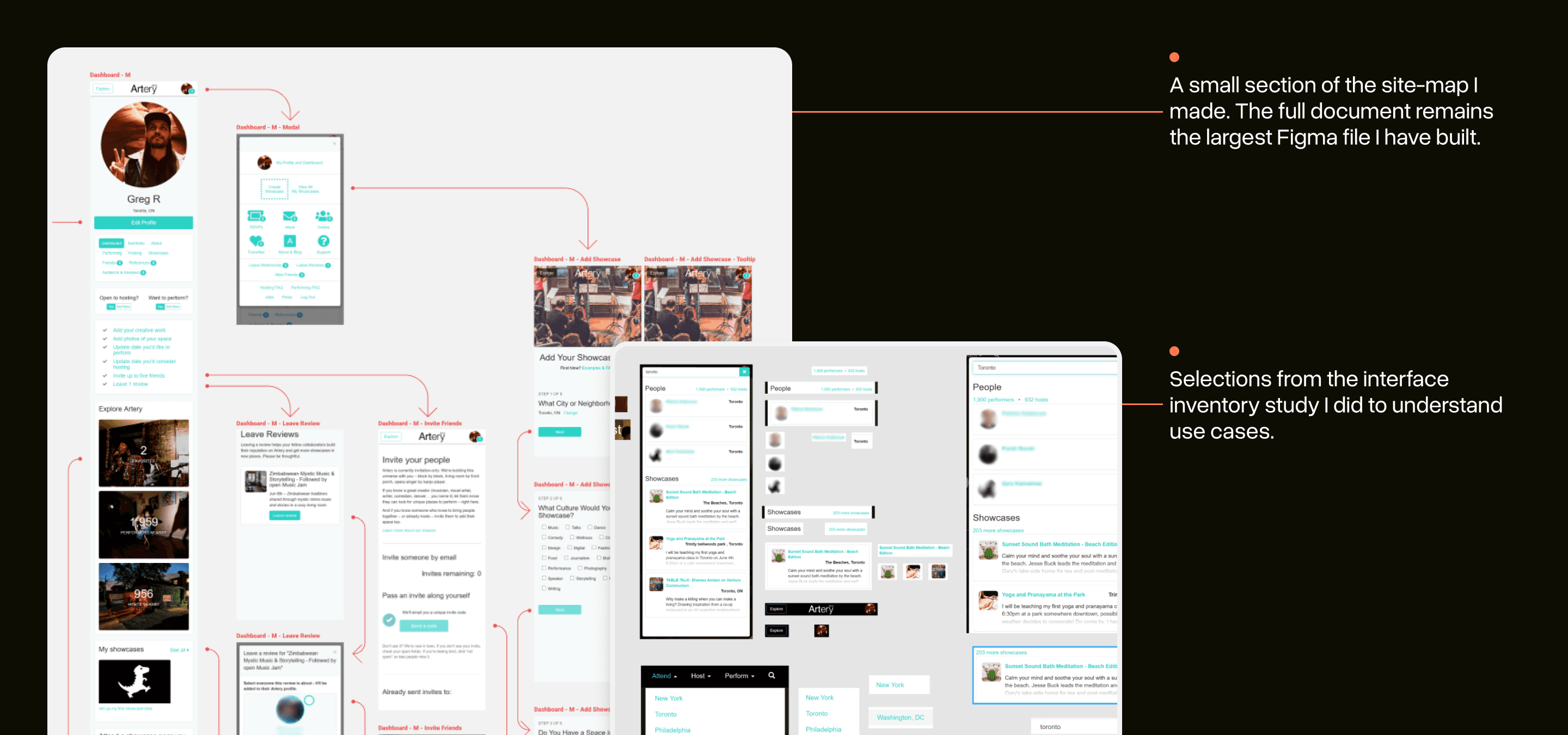
When I joined, Artery was already quite big with features like: search, reviews, chat, payments, and more.
If I was going to construct a new system, I knew I needed to have a good sense for the design challenges faced by Artery’s current interfaces.
I did a large site-mapping exercise to start. This gave me a sense for various flows and a look at how these interfaces fit together.
I also made a small interface inventory (popularized by Brad Frost) to see common UI patterns and where interface inconsistencies tended to crop up.
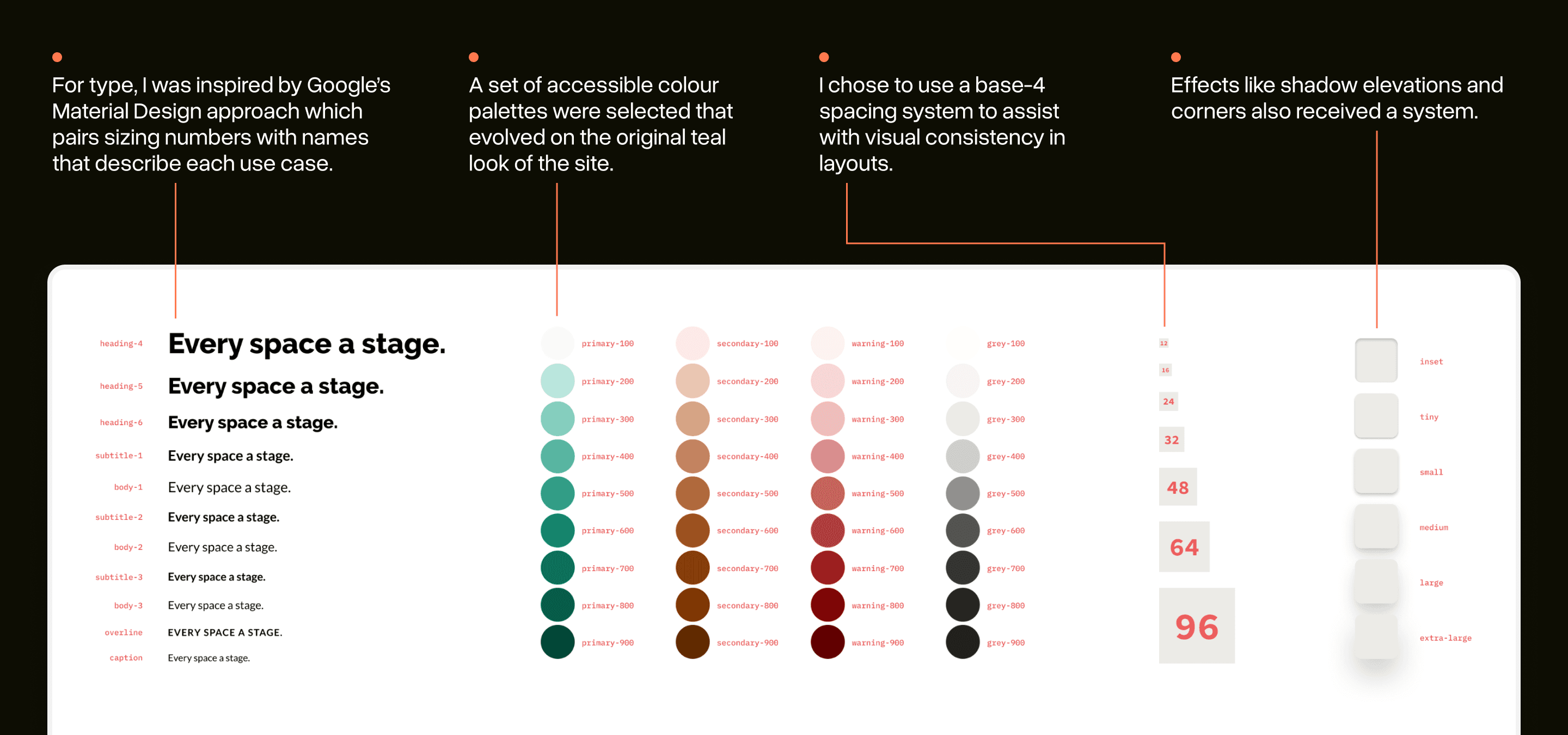
Starting with good fundamentals
When teams think about design systems, they often think of components only: buttons! forms! etc.
These would eventually be important, but only if the spacing, type, colours, and effects that they were made of were fundamentally strong.
Because of this, I iterated often with the team on these low-level design choices. In Wathan & Schoger’s Refactoring UI, they emphasize how essential this step can be.
By having a set type and spacing system you can “make less decisions” as you design so your team can move faster.
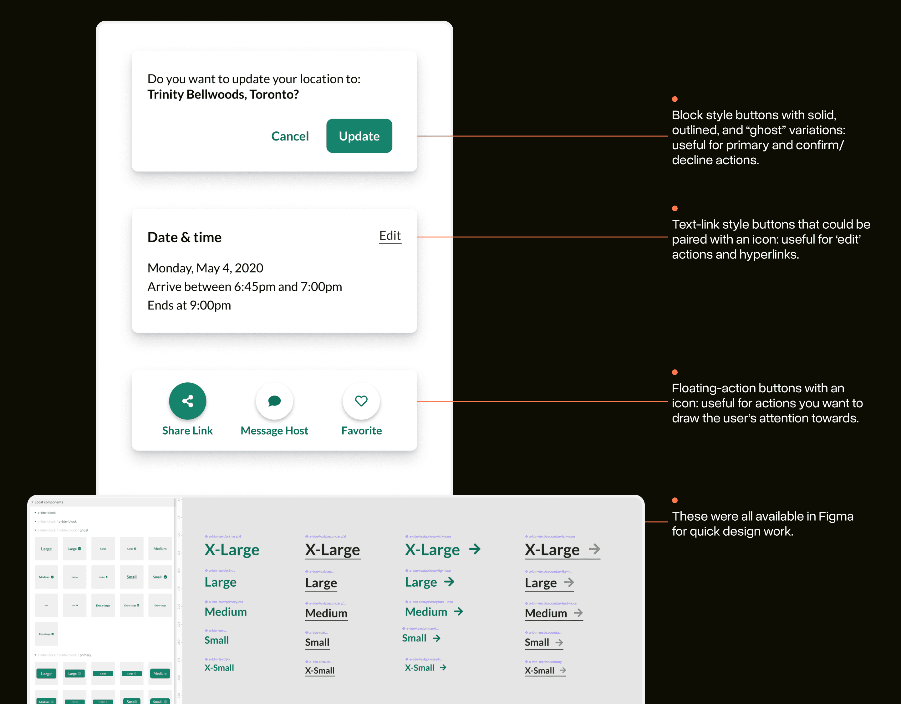
The basics in action: the button system
With good design choices made, I added components to the system as use cases emerged. Having a good button system was needed almost immediately.
Reviewing other design systems, I noticed how few button variations were often included. Likely because they knew their interface needs well already.
Artery didn’t have this luxury just yet, so I experimented with approaches over a few months of UI projects and eventually settled into a two-layered button system:
Three major button types: block, text, floating actions
A common API for each: type, size, icons, modifiers
Having only three types and a common API made it easier for developers to work with them on the fly.
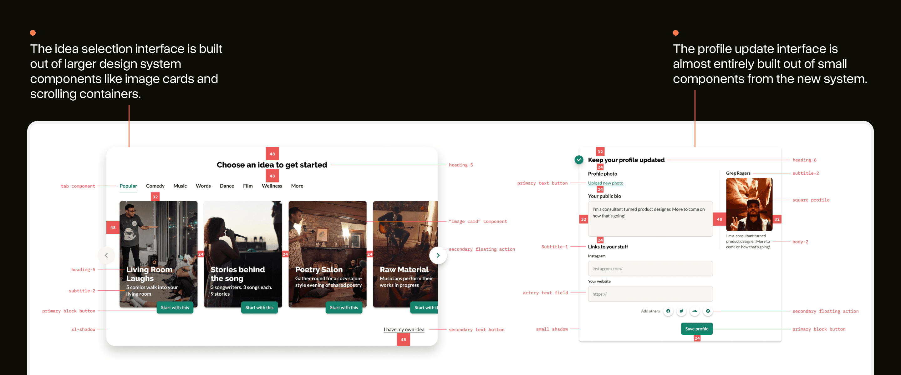
Designing with LEGO bricks
With all these little design decisions around type, spacing, and components made, it became far easier to build great looking interfaces out-of-the-box.
Interface design at Artery started to feel much more like working with LEGO bricks rather than Play-Doh.
I’ve annotated some real interfaces from Artery with the system in use. Often, these interfaces required minimal additional work beyond using the tokens and components from my system.
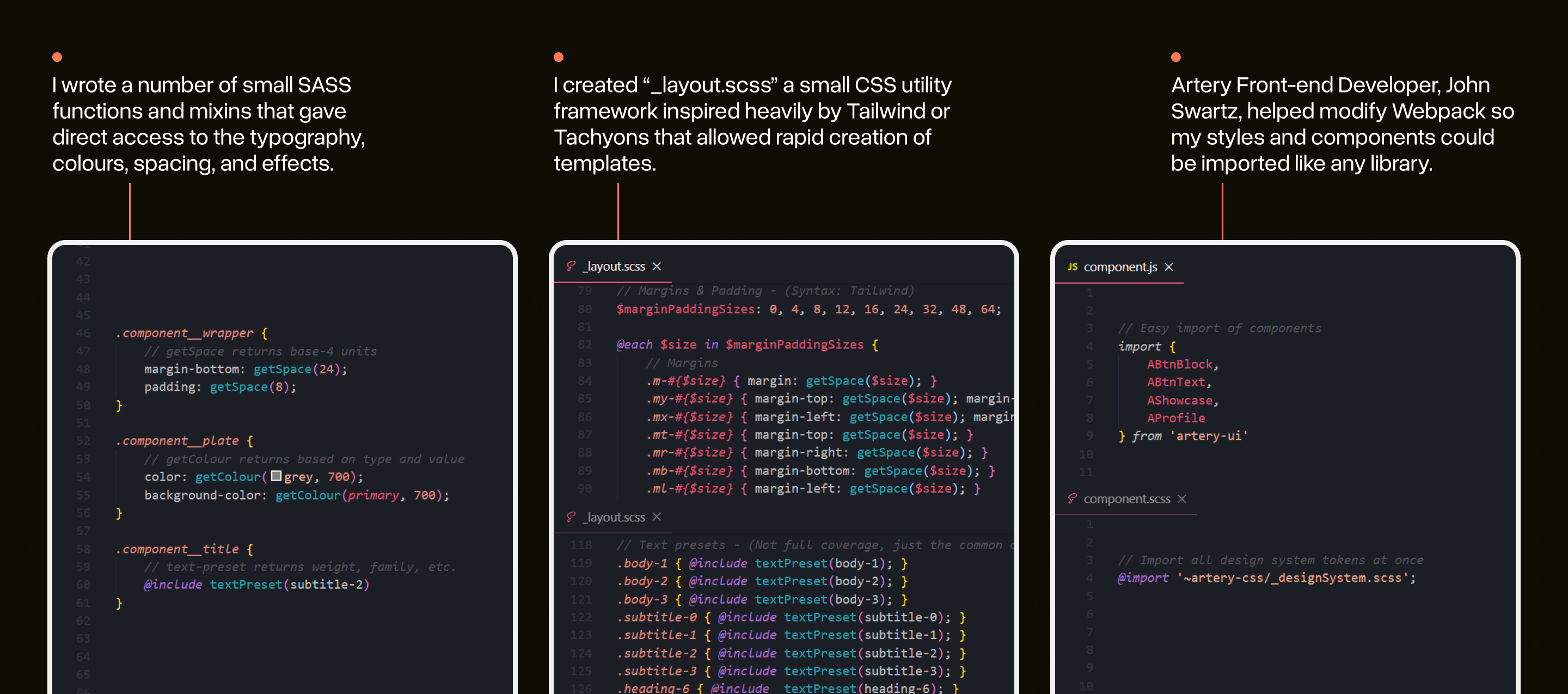
Bringing the new system into code
Design systems cannot exclusively live in Figma or Sketch: adoption and re-use of the system is only possible if it’s dead-simple for developers on the team to make use of it.
I took this challenge seriously and (over multiple projects) worked to provide a good developer experience (DX) for the system as it evolved.
Over-time these variables, functions, and utilities became the ‘true’ representation of Artery’s design system rather than a design tool.
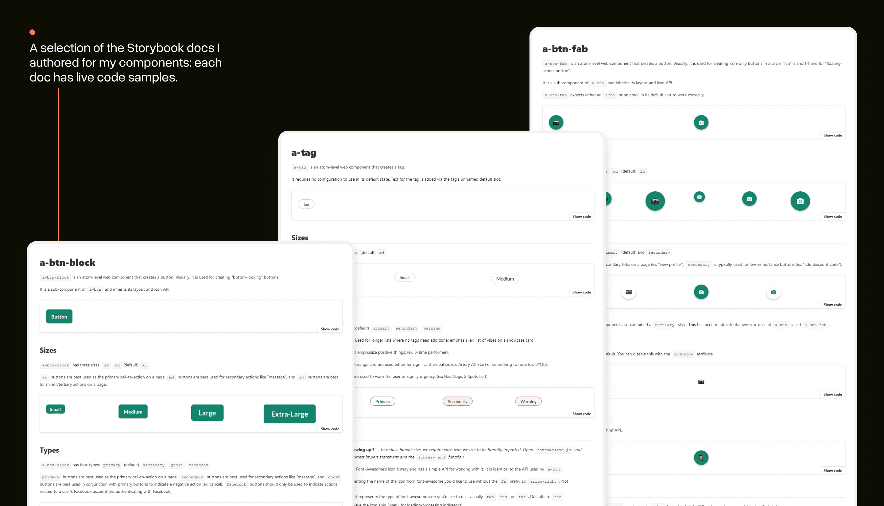
Documenting design & APIs in Storybook
While these utilities and functions were useful for low-level needs, larger components needed more complex solutions.
I worked with the team to set-up Storybook: a workshop environment for design systems that makes it easy to build new components and document their APIs.
I wrote markdown-like documentation files that could be used in Storybook to demo components, see code samples, and review how the API for each works.
Design systems are for people first
The challenge with choosing to systematize anything about the design of an app is that it will always degrade. Trends change, new use cases emerge, and some views get more love than others.
Developing Artery’s design system helped me discover that a design system doesn't have to be about fully unifying your design efforts.
Instead, you create design systems to build a shared consensus so you can move faster. The less time you spend debating design details is more time you can spend iterating on features that provide real value to your users.
Artery’s design system certainly provided a much-needed visual elevation to the platform, but more importantly, it gave our team more time to focus on the bigger questions.
Acknowledgments
This project wouldn't have been possible without the help of the Artery team. Thank you to Artery Co-Founders, Salimah & Vladic, for endorsing the approach and being willing to agonize over colours with me, and John for teaching me everything I know about abstracting code properly.
Imagery from Artery events are not my own: each was taken by an Artery team member and is owned by Artery.