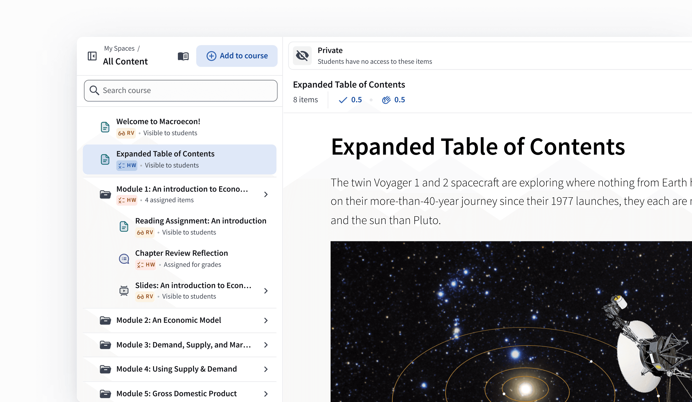
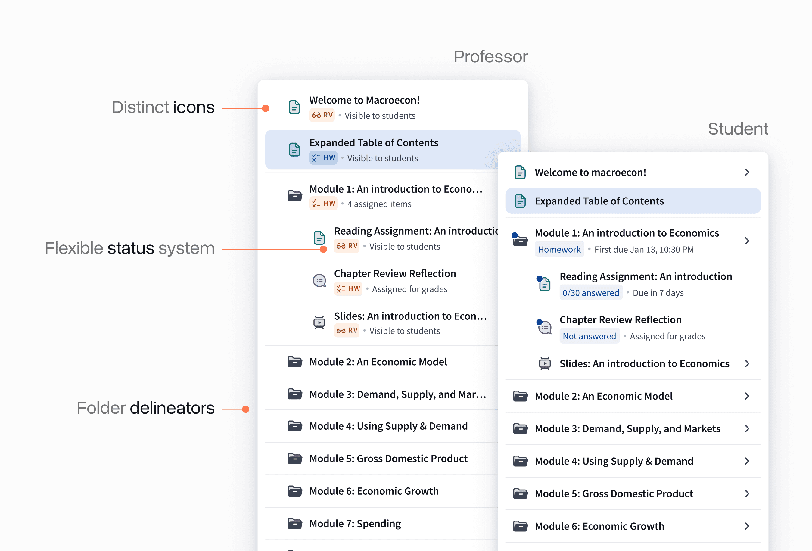
In 2021, I overhauled Top Hat's content tree: the most used and essential interface in the entire platform. You can think of it as the file system for any course on the platform—the primary way professors organize their content for students.
The result was a faster, more intuitive experience that made organizing and accessing course content easier for both professors and students.
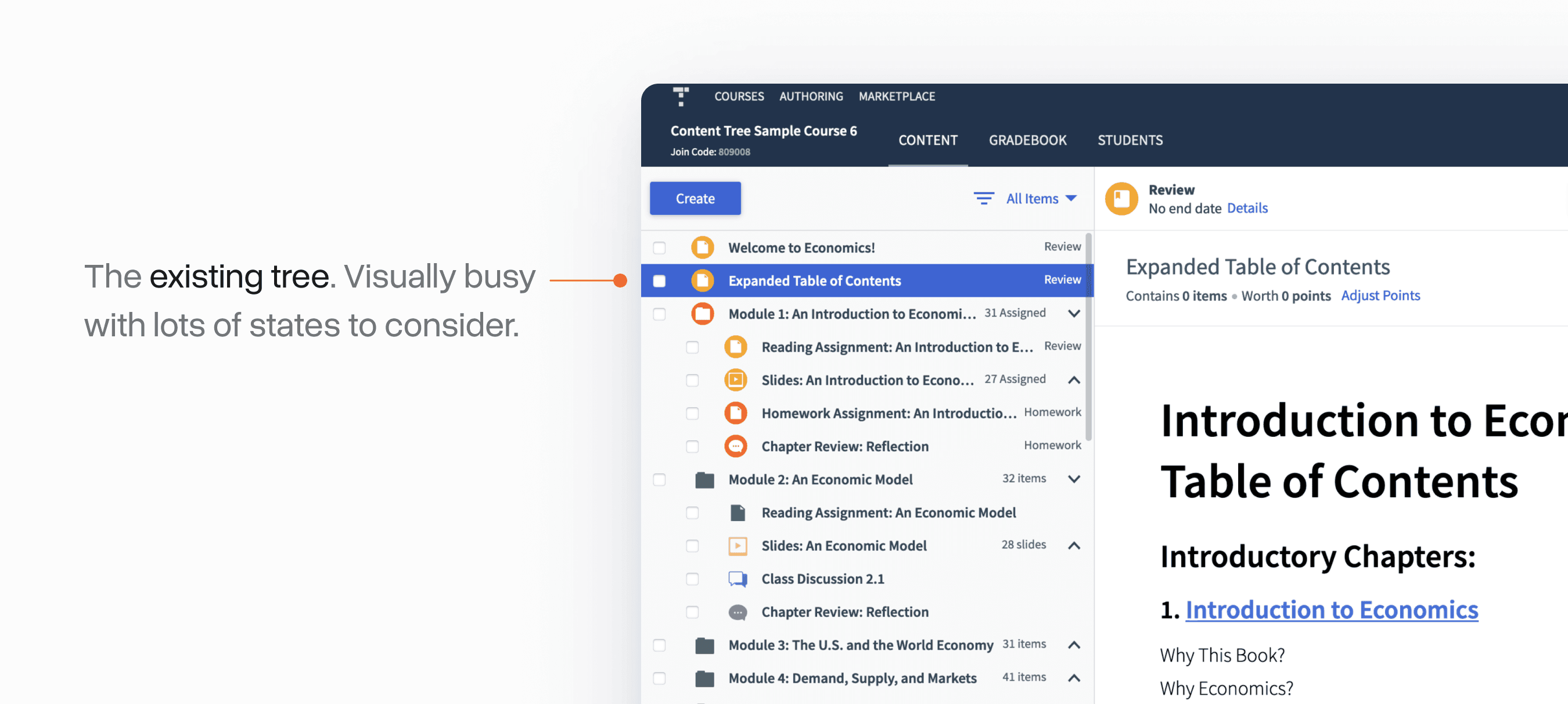
Where we started
The existing content tree interface was visually cluttered and hard to understand. This stemmed from the many different states and functionalities packed into it: many of which had evolved significantly over the years.
In reality, the tree really had 3 core jobs to be done:
Organizing course materials quickly: expected behaviour from other file systems
Communicate the state of the course: what's been assigned to students and what hasn't
Navigate to specific content: quickly and reliably find items for editing or management
One of the areas where the tree failed most was arranging content via drag and drop. Nearly 95% of positioning changes in the tree were done this way, yet the drag and drop experience was extremely clunky, unclear, and unreliable.
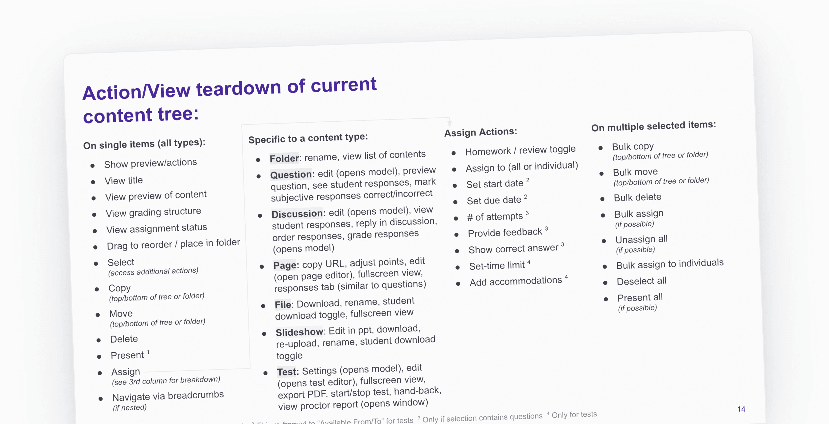
Gathering input and options
An early exercise I did was simply inventorying the entire system. There were many existing actions in the tree with lots of nuance around what could be done where:
I also spent time looking at comparable "file systems" from best-in-class products to see how they managed many of these cases.
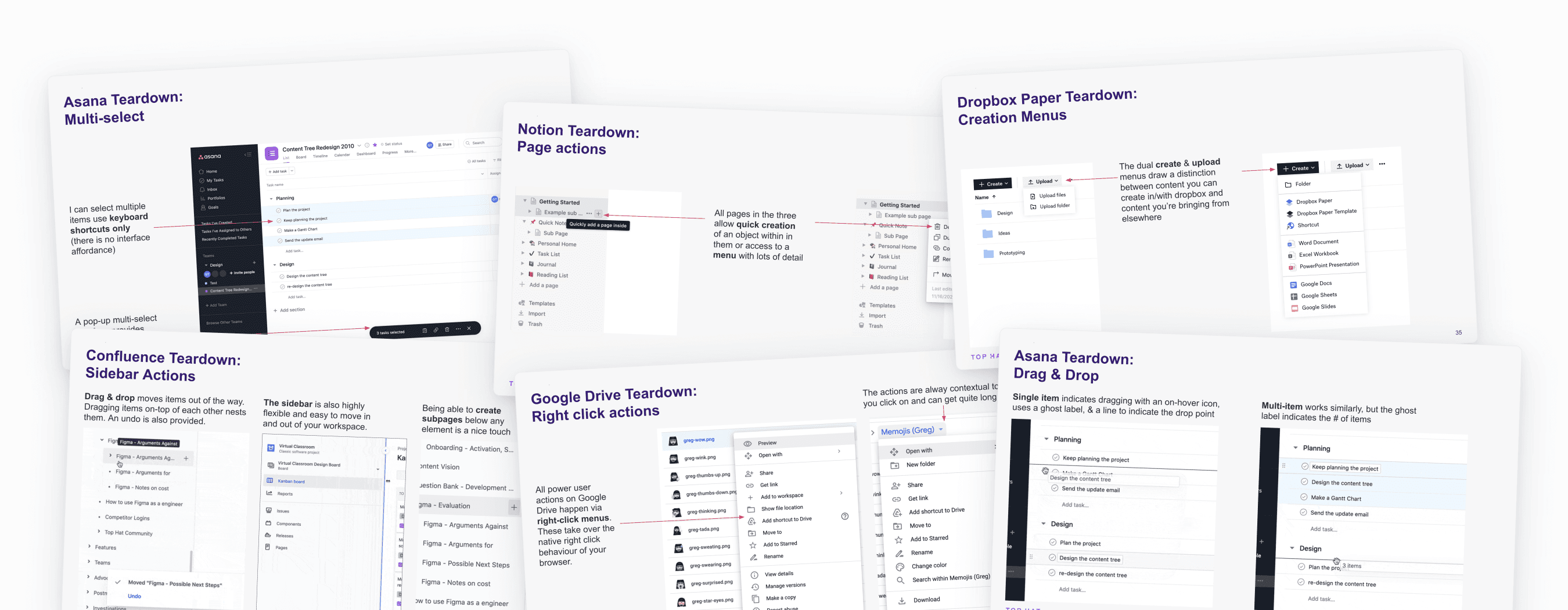
Looking at products like Asana, Confluence, Google Drive, Dropbox, and Notion, several common patterns emerged:
Drag & drop: Standard across web apps with undo support and keyboard shortcuts for bulk selection
Three-tier structures: Top-level menus, ordered lists, and detail views
Visual layers: Section headers and tags enable custom organization
Search patterns: Consistent implementations provide clear patterns to follow
Early explorations
The remit for this project was extremely open-ended, so I spent a lot of time at the beginning showing stakeholders many different possibilities to narrow our focus.
None of these were intended to be easily scoped to something we would build, but rather to provoke discussions about what might be possible.
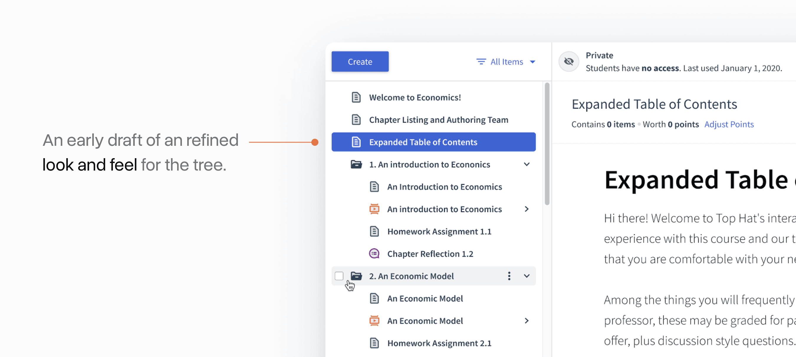
I was really bullish on rethinking the top level of the course to be less folder-based. This concept looked at visually reframing these as "sections":
Another interesting concept was building in a "student view" toggle that would quickly filter what was and wasn't assigned to students:
Another explored something similar to a task manager like Asana, where the tree was split into multiple panels:
A bit later, I got curious about reducing deep nesting with a "double-click" expand view:
A really wacky one explored getting rid of the concept of different content types in our system and instead allowing all of them to be viewed in different forms: as a presentation, a list, a textbook page, etc.
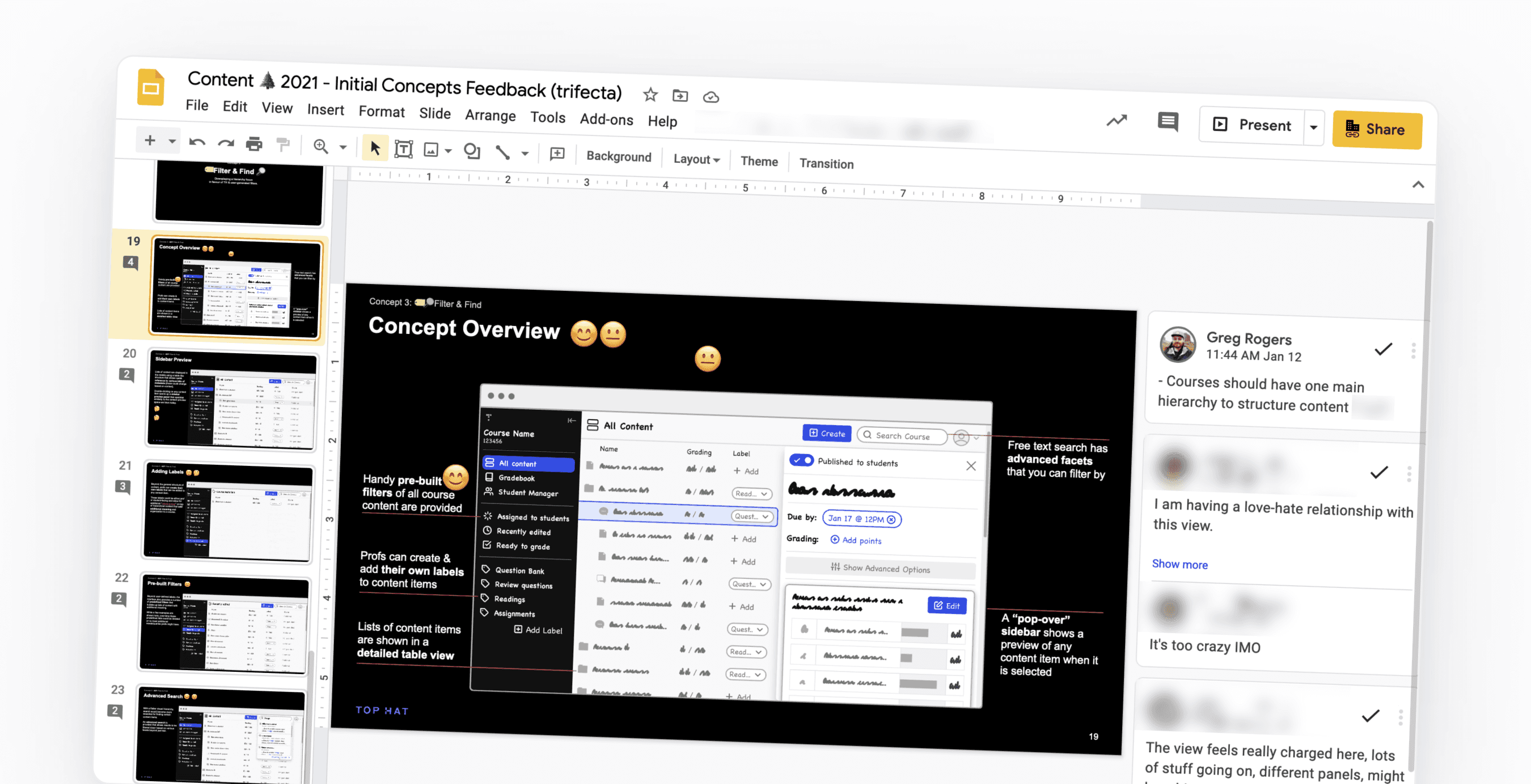
Gathering async feedback
As I was working on these concepts, I tried to cut down meetings by putting everything into a big slide deck where stakeholders could give feedback asynchronously and use emojis to communicate what resonated:
Moving to hifi
All of this exploration quickly focused our efforts on getting the initial redesign right. This went through a lot of evolution later, but much of the visual foundation started here.
At the same time, we had to make tough choices about what key features we were actually going to build in the short term. We narrowed in on a handful of concepts that we scope-hammered further.
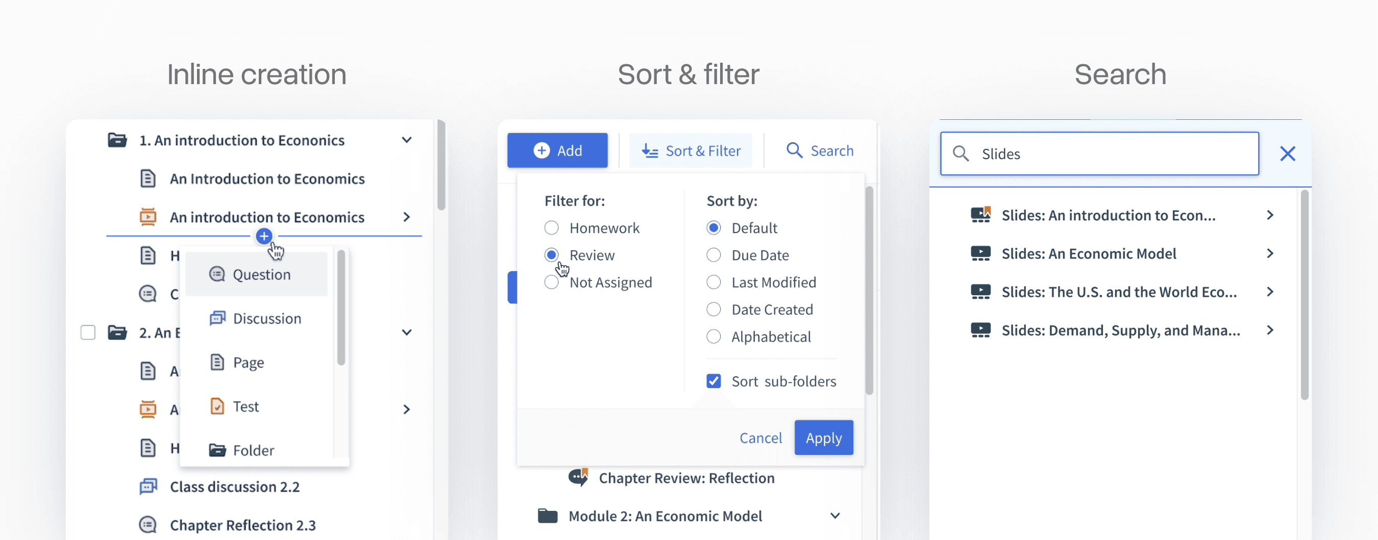
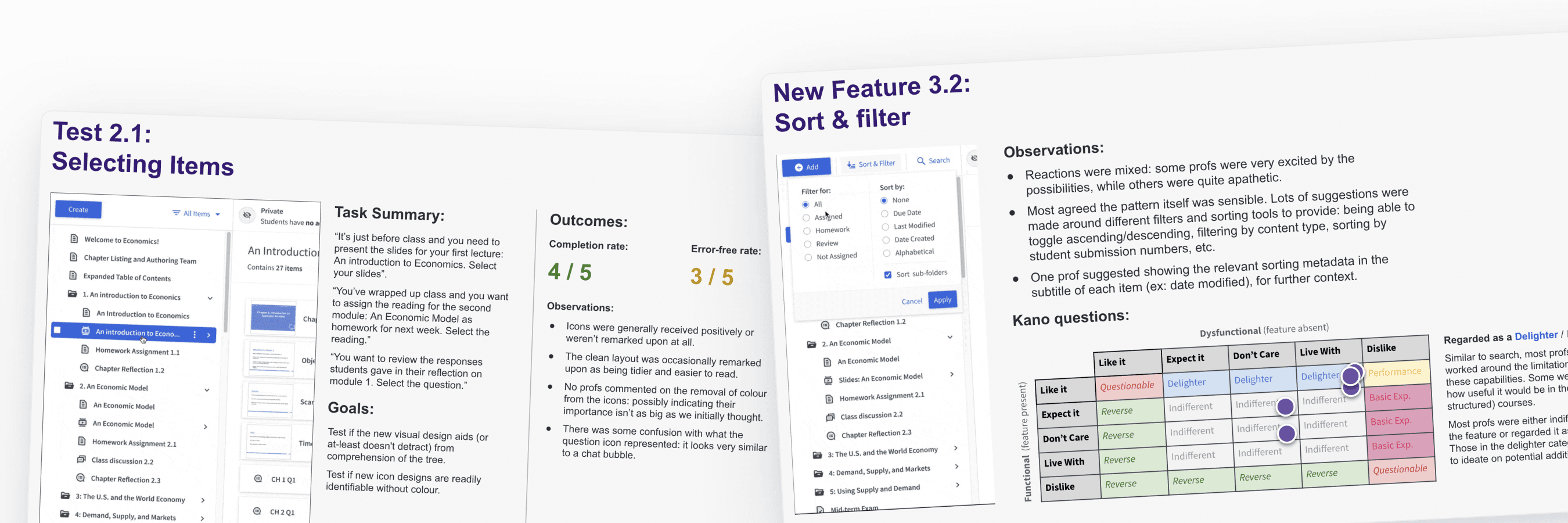
To help make some of these decisions, we conducted a series of usability and concept tests with Top Hat power users to make sure we weren't breaking any key workflows.
We used a variant of the Kano Model to classify desirability for some of the more complex-to-build concepts in our list.
Refining iconography
Each item type in the tree has distinct functionality and appears throughout Top Hat's UI. The icons needed to be visually cohesive yet distinct while working at very small sizes.
I went through many iterations, eventually settling on a duo-tone style with distinct shapes for each type.
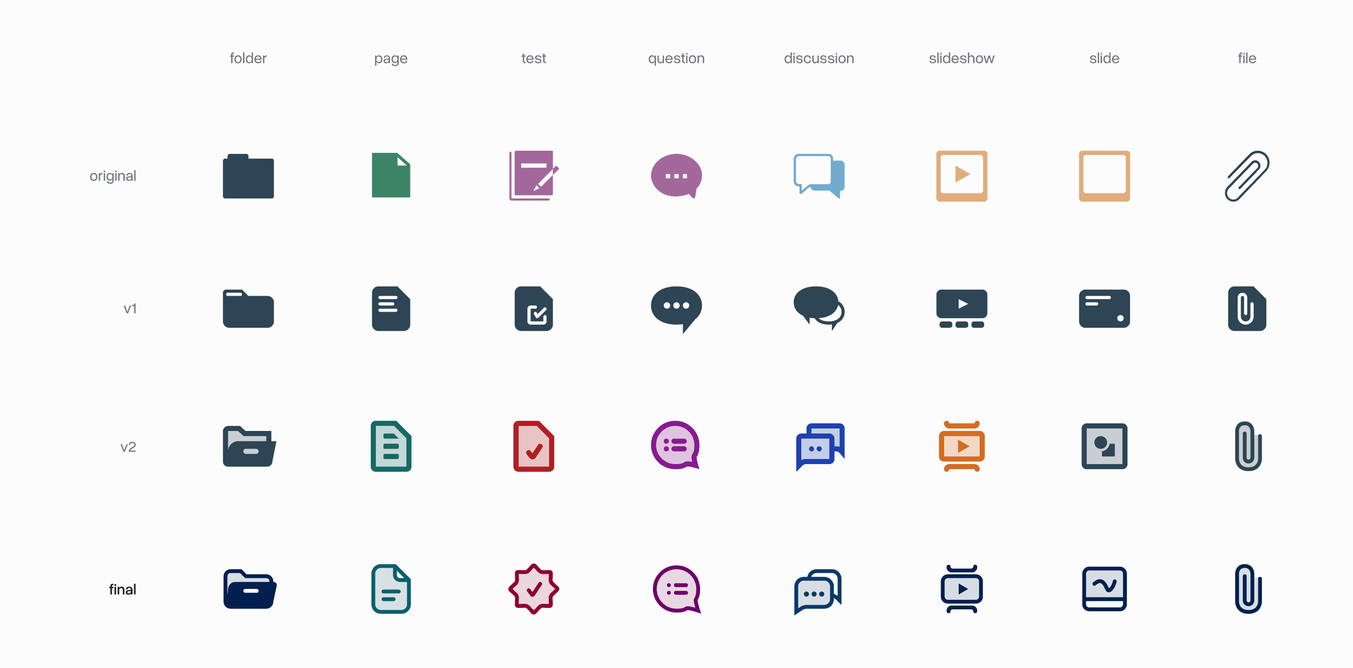
But fixing the base icons was only half the challenge. Each item could exist in multiple states to communicate student visibility, grading status, and more.
Top Hat had an existing homework and review system using orange and yellow that I wanted to preserve during the transition. I explored many variations at this stage, bringing several into usability tests.
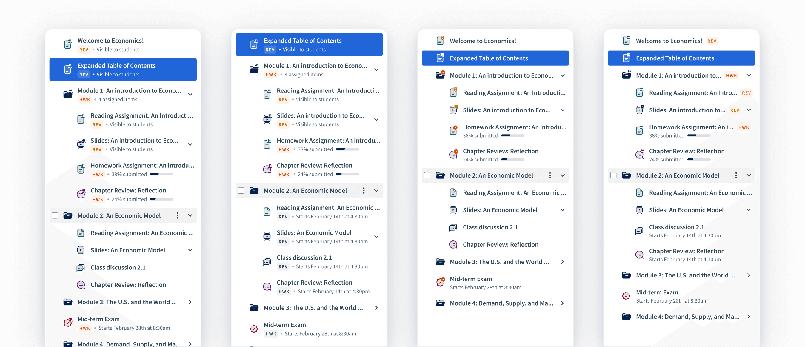
All of this iteration eventually led us to the final design system that we shipped:
Nailing drag and drop
Drag and drop was easily the most complex interaction we had to nail in this new system. I researched many React libraries, trying to find one with the most elegant implementation.
We settled on react-beautiful-dnd from Atlassian, which provided extremely smooth movements even for long drags.
Because the tree is a nested list, we also had to consider affordances for more complex drag actions like dragging multiple items into a folder.
We also closely modeled how Windows Explorer and macOS Finder handle multi-select, with affordances for grabbing many items at once or cherry-picking specific items.
Keyboard accessibility
We spent a lot of time nailing the approach to making the entire tree able to be both navigated and modified using just the keyboard. This can be surprisingly complex when it comes to nested trees, but I think we found a good balance:
Acknowledgements
Thank you to Polly Zhang who PM'd this project and made the case for why we needed to do this. Also thank you to Marc Cataford, whose engineering team worked a lot of magic behind the scenes.