A big part of the experience of using Top Hat as a professor is actually authoring the content you'll use in your course. Top Hat's platform is extremely flexible with a lot of different content types to use for this.
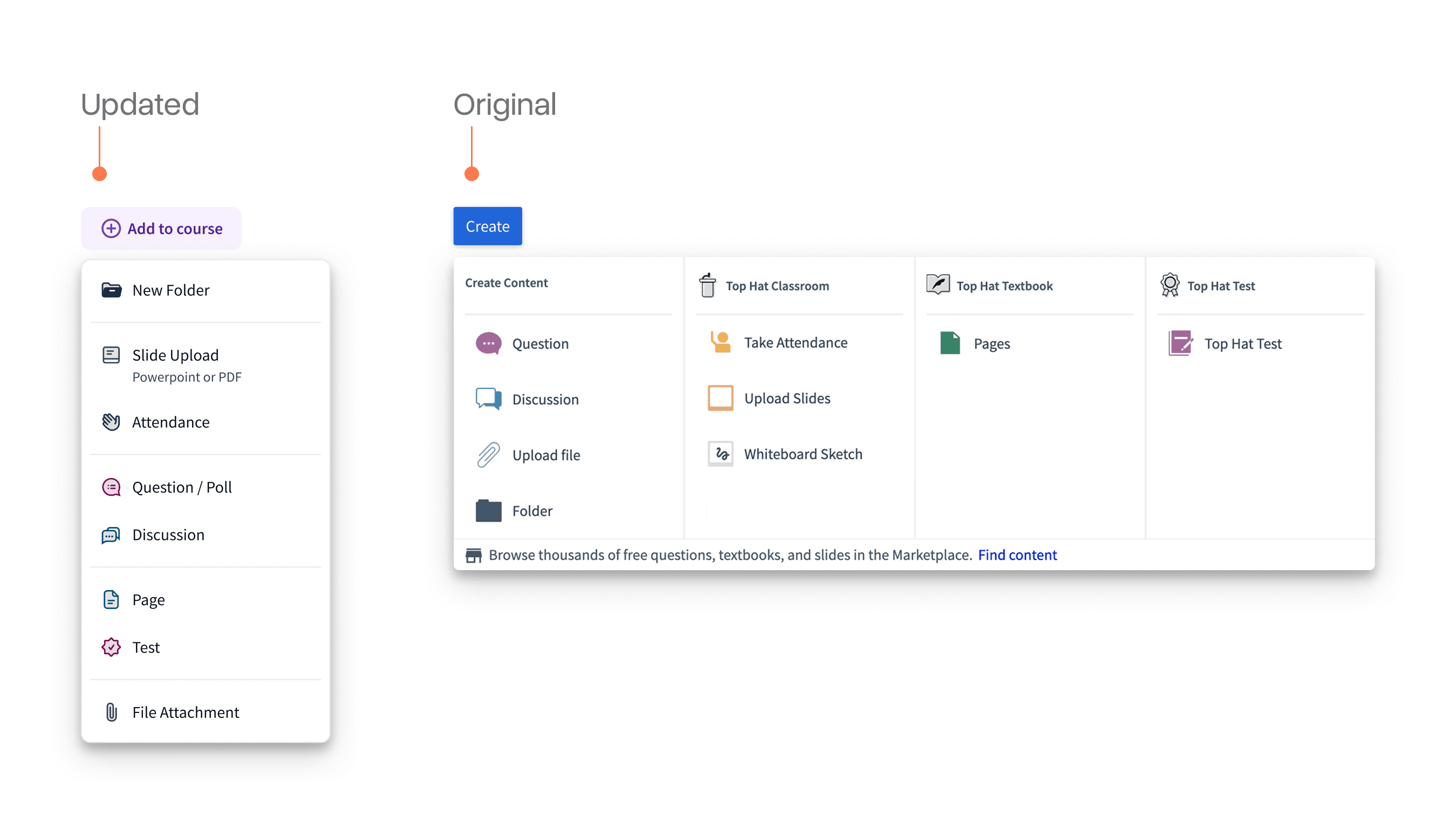
We set-out to evolve the primary entry point for creating content to make it easier to discover all the different ways professors can author content on the platform.
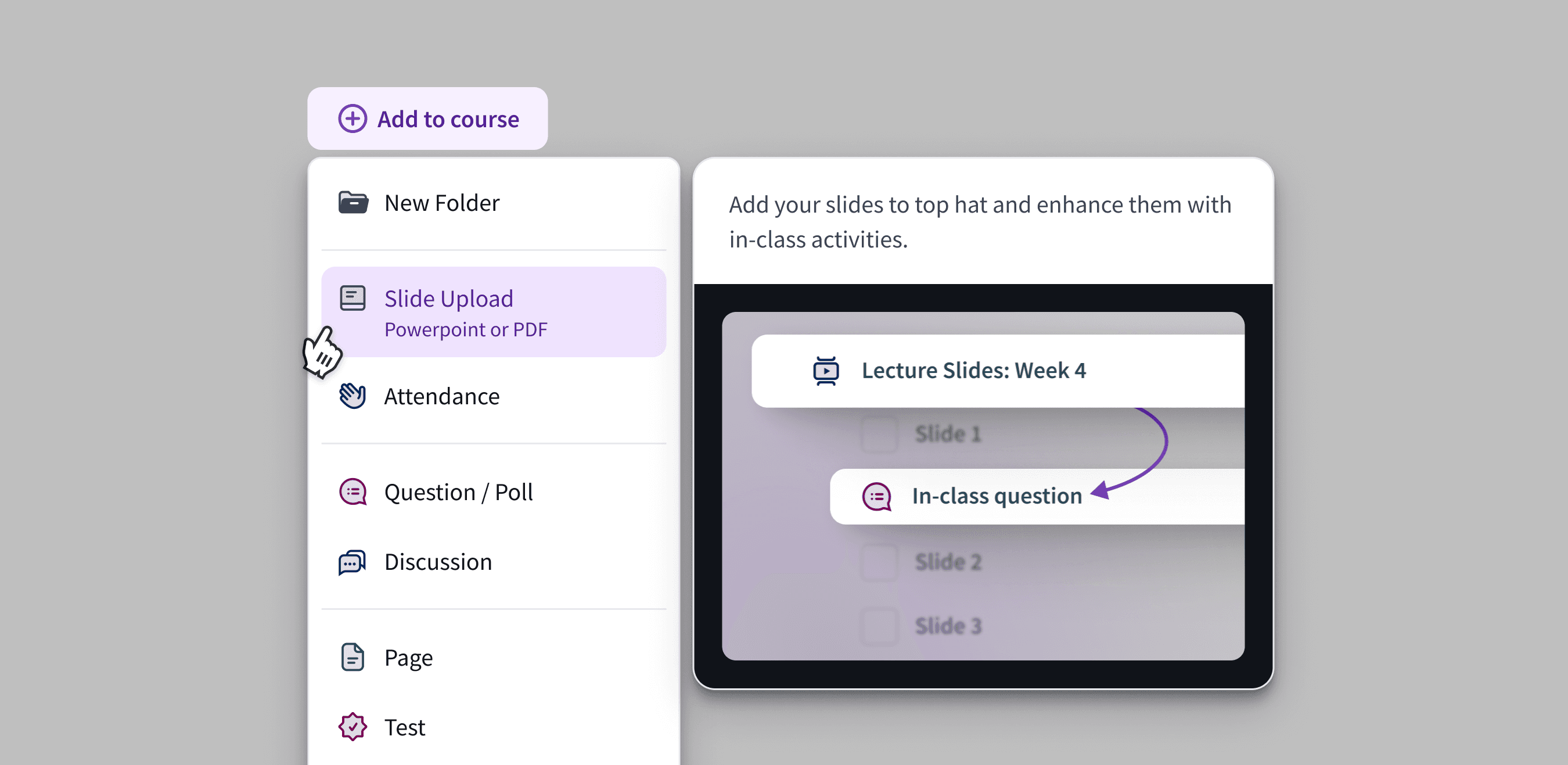
The final design provided a focused menu with clear tooltips for each content type and guidance on how to use it.
This updated design was a significant upgrade over the previous version which largely organized information around product lines and did not provide any guidance on how they might fit together.
I spent a lot of time refining the copy and imagery for the tooltip on each content type. In many cases, a key part of the puzzle was illustrating the outcomes and combinations of these rather than just simply saying "add page", "add question", etc.
The actual title of the button itself was also important. The previous version used the more ambiguous "create" language and I had a suspicion this was also affecting the usability of the menu.
We ran a brief A/B/C test where we tested various names for the button and reviewed their relative performance.
It was interesting to see phrasing around "add" or "add to course" alone made a significant difference. Professors were much more likely to use the menu when this was the case. An important reminder of what can be done just with copy.
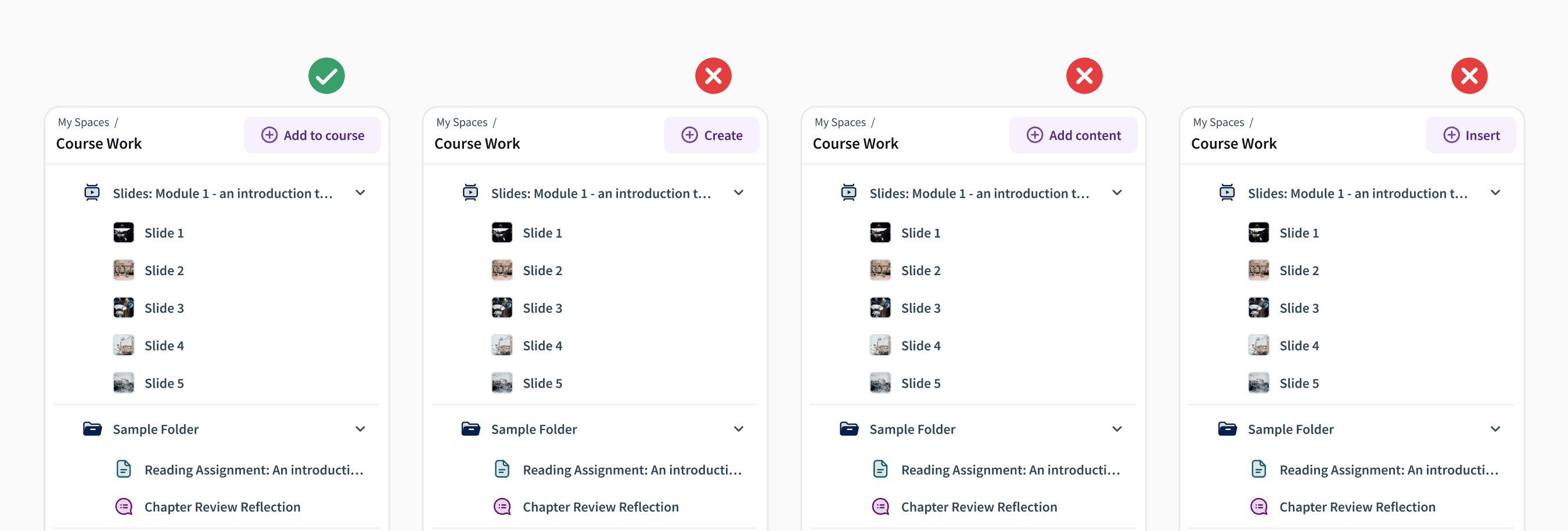
Rounding out the build was an implementation of a mini version of the menu on the items already added to the course. Previously, professors could only add things via the main version of the menu which made it a lot harder to target placing something in a discreet location.
Acknowledgements
Thank you to Adrian Gazzoli who PM'd this project with me and Matthew Watt who led the engineering efforts. Sometimes it's fun to fix the papercuts instead of build bigger features.